Dipak
ICC Board Member
- Joined
- Mar 17, 2010
- Location
- Mumbai, India
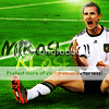
The Terry one is phenomenal  The Ronaldo one looks great as well
 ")
The Ronaldo one looks great as well The Ronaldo one looks great as well 
 ..total stunner mate.The text effects are phenomenal.Really loved all the avatars. All are done perfectly in my opinion.

Don't mind it but i think you should try to work more on large artwork like sigs.
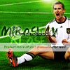
Sorry to be a nitpicker, but could you please make the entire "Miroslav" text visible?Do it if you have the time and the psd, but I'll use the current one anyway. Awesome work.