You are using an out of date browser. It may not display this or other websites correctly.
Requests Accepted Ali's Designs - Best Graphics Thread of 2017, 2018 & 2020 (Still the best!)!
- Thread starter AliB
- Start date
Yash.
ICC Board Member
India
Ireland
ENG....
SRH...
QG
PlanetCricket Award Winner
Melbourne Stars
X Rebels
Looks really good. Applied it as a wally for some time. The background and the text effects look awesome. Especially that background 
However, the logo could have been blended a little bit better. With the white stroke and the short shadow, it seems that it has just been stuck upon, and is not part of the wally.
Overall, it is really good.

However, the logo could have been blended a little bit better. With the white stroke and the short shadow, it seems that it has just been stuck upon, and is not part of the wally.
Overall, it is really good.
AliB
ICC President
India
AFG...
Mumbai Indians
PlanetCricket Award Winner
Adelaide Strikers
X Rebels
Agree on that, the thing is I put up all the hard yerds in the background and text so was a bit lazy while working on the logo, I'll give a shot at it tomorrow.However, the logo could have been blended a little bit better. With the white stroke and the short shadow, it seems that it has just been stuck upon, and is not part of the wally.

Yash.
ICC Board Member
India
Ireland
ENG....
SRH...
QG
PlanetCricket Award Winner
Melbourne Stars
X Rebels
Freakin awesome! Looks really really cool!

AliB
ICC President
India
AFG...
Mumbai Indians
PlanetCricket Award Winner
Adelaide Strikers
X Rebels
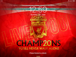
That escalated well unexpectedly! The thing is we don't have many effects on the corners so it pretty much fits well! I'll try adjusting a 19:9 one for phones as well by tonight.Looks awesome on my iPad! (Altho it has a 4:3 screen, but still looks awesome)
View attachment 233746
 This might well get me back to regular graphics
AliB
ICC President
India
AFG...
Mumbai Indians
PlanetCricket Award Winner
Adelaide Strikers
X Rebels
A couple of more versions...Some tinkers and here's a 19:9 mobile version...
View attachment 233774


Yash.
ICC Board Member
India
Ireland
ENG....
SRH...
QG
PlanetCricket Award Winner
Melbourne Stars
X Rebels
The first one in this looks the best of the lot. The second one looks good, but I had to turn the brightness way up, to see the background clearly.
AliB
ICC President
India
AFG...
Mumbai Indians
PlanetCricket Award Winner
Adelaide Strikers
X Rebels
The thing is a couple of my friends requested those for their personal uses.The first one in this looks the best of the lot. The second one looks good, but I had to turn the brightness way up, to see the background clearly.
AliB
ICC President
India
AFG...
Mumbai Indians
PlanetCricket Award Winner
Adelaide Strikers
X Rebels
Sure, if you can find me suitable renders? 9:16 or other phone versions tend to need more HQ resources as compared to PC versions.Open for requests??
If yes, can I get an Andrew Flintoff lockscreen? (9:16)
Preferably Ashes 05
Users who are viewing this thread
Total: 3 (members: 0, guests: 3)


