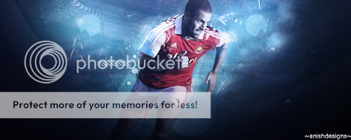
Anish Designs | Back at it Again! | :D

Didn't like KP ava that much and so the Smith siggy. Smith and clarkey ava looks good, though in the clarkey one, the opacity of duplication of player could be reduced. Looks great otherwise. :)
 
Last edited:
Agreeing with Simon and Meet there , the BG in the signature doesn't suit and looks good , but the render effects look incontrovertible . KIU . :cheers
 
New Icons :)

Boom_zps37fba090.png
Clarke_zpsea26f95f.png
KP_zps0d8facb2.png
Swann_zpse7ec9fda.png
Ashes_zpsac096165.png
 
Pretty much what Simon said , good works though . KIU . :)
 
Avys look awesome Steven smith siggy looks a bit overdone in-terms of blurdness you added if you would have kept it simple with the simple effects it will be a cracker jack!
 
The avas are not your best really. You can do much better than that. Text in the last two avas can be improved. Lightning could be improved too.
Sagna sig looks incomplete, there is more you can do in it and some good text will complete the other sig. ;)
 

Users who are viewing this thread

Top