These are nicely done especially the CR7 sig.
You still seem to be struggling with the text,I'd again suggest going with simple fonts in small sizes/no text in icons unless you feel there's a need of text to fill up the emptiness.Good going nevertheless.
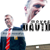
David Moyes is your best there in my opinion, Ronaldo and Gerrard ava looks a tad too dark some kind of light source was required there. The siggy is just a disappointment to what you have shown everyone what you can do come on get your head up again.
Edit - The text is wonderful! Name of the font on the siggy?
AS everyone said above , the Moyes one is brilliant but the other two looks a bit dull and unfinished. The Lewa siggy rocks especially the text which has been awe-inspiring as prevailing. KIU.
Moyes is the best one out there..The sig does not have the usual Anish Designs finishing that is visible in the other artworks..Nevertheless,Keep it Up!
This site uses cookies to help personalise content, tailor your experience and to keep you logged in if you register.
By continuing to use this site, you are consenting to our use of cookies.


")