You are using an out of date browser. It may not display this or other websites correctly.
Anish Designs | Back at it Again! | :D
- Thread starter Anish.
- Start date
Mukesh.
Banned
Awesome work man Super


Rizwan_zak11
Associate Captain
- Joined
- Feb 4, 2013
Cool! 
However you could have reduced the watermark bit. First Iniesta one look screwed up with blurring effect , 2nd one is brilliant! Nevertheless.

However you could have reduced the watermark bit. First Iniesta one look screwed up with blurring effect , 2nd one is brilliant!
 Nevertheless.
Dipak
ICC Board Member
- Joined
- Mar 17, 2010
- Location
- Mumbai, India
Muller siggie is really nice, just needs some BG work in the left and some text. I'd give you a 7 for that 

GlitchInTheMatrix
ICC Board Member
- Joined
- Dec 15, 2011
- Location
- Chennai,India
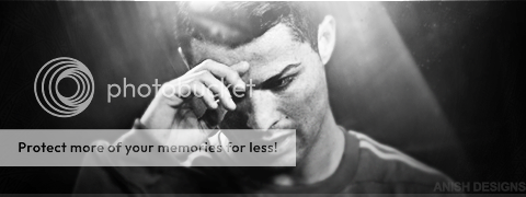
Brilliant stuff Anish.... the avatars look neat and excellent. The colours are balanced and the font in the 2nd one suits the ava perfectly.
Coming to the sig... it looks good. Considering that this is your first in recent times... it is excellent. I really liked the background..Render effects look neat.. colours are balanced
Overall much better.. you sir, are back with you touch. KUTGW!!

Coming to the sig... it looks good. Considering that this is your first in recent times... it is excellent. I really liked the background..Render effects look neat.. colours are balanced
Overall much better.. you sir, are back with you touch. KUTGW!!


SiriusBlack
ICC Chairman
- Joined
- Mar 22, 2011
edited
- Joined
- Mar 30, 2011
- Profile Flag
- Canada
Ah, didn't see these.
Great work on all of them, almost flawless to all of the work you done there, but the first Iniesta avatar lacked some lightning and looks a bit too blurred (or is it just the stock)? The second avatar is awesome no flaws to be seen what so ever.
The siggy is brilliant, although I'm not a big fan of the watermark text, make smaller? Other wise it is awesome!
Great work on all of them, almost flawless to all of the work you done there, but the first Iniesta avatar lacked some lightning and looks a bit too blurred (or is it just the stock)? The second avatar is awesome no flaws to be seen what so ever.

The siggy is brilliant, although I'm not a big fan of the watermark text, make smaller? Other wise it is awesome!

SiriusBlack
ICC Chairman
- Joined
- Mar 22, 2011
edited
Rizwan_zak11
Associate Captain
- Joined
- Feb 4, 2013
This is something different and gr8 work from you!

Similar threads
- Replies
- 75
- Views
- 6K
- Replies
- 22
- Views
- 2K
Users who are viewing this thread
Total: 3 (members: 0, guests: 3)


