Channel 4 TV Overlay REQUEST

Danny,this is what I can call a 'Perfect' TV Patch.
great work!

But on the spider the lines seems to go outside the circle representing the ground.If u could make the circle bigger..it would be really cool!
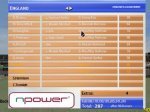
& I prefer the 2nd color(the lighter one as the notout batsmen's name are clearer)
 
This is looking fantastic mate!! Can't wait to try this one out!! Is there any way you can round off the corners of the text boxes? If you can do that, I reckon it will be nearly complete. WELL DONE!
 
bharat said:
But on the spider the lines seems to go outside the circle representing the ground.If u could make the circle bigger..it would be really cool!
Hawkeye spider diagrams are purely to show shot direction, not fours and sixes.

This could be realistic as Channel 4 use Hawkeye.
 
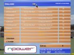
does the scorecard look better with a background or should i leave it out like the ones ive posted earlier?
 

Attachments

  • 1.jpg
    1.jpg
    39.6 KB · Views: 103
  • 1.jpg
    1.jpg
    40.4 KB · Views: 101
Last edited:
The Channel 4 Television Graphics Patch looks excellent- I prefer the statistical graphics with the background but it needs to be wider with a border.
 
house.elf1981 said:
This is looking fantastic mate!! Can't wait to try this one out!! Is there any way you can round off the corners of the text boxes? If you can do that, I reckon it will be nearly complete. WELL DONE!

does anybody know how i can do this? im using paintshop pro9. thanks

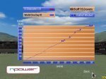
worm chart
 

Attachments

  • 1.jpg
    1.jpg
    34.7 KB · Views: 86
I notice Das Vicky did it with his ESPN patches. For me I would cut it out using a different colour for the paint brush. Then making that bit transparent.
 
cjackson11 said:
no back ground please, great work can't wait

Yes it was better without the background.

& for rounding off the corners of boxes u can use FillType="18" in the ig_scorebox_pc.rfe
 
That would work the score popups but all the others wouldn't as I would take most of the graphics are 640 by 480 with transparent bits.
 
The background makes it realistic. Please keep it, or release it in two versions.
 

Users who are viewing this thread

Top