evertonfan
Chairman of Selectors
My graphics thread is always full of people wanting tutorials so I thought i'd finally get off my lazy backside and make one for you all.
The aim of this tutorial is to achieve a signature in this style;

It may look complicated, but you'll be surprised with how unbelievably easy it is to make, so let's get cracking. First of all, open up a new document in Photoshop with these settings but you can use whatever size you want. For this tut I will be using 400 x 150;

Go to the paint bucket tool and fill this layer with black and then slap your render on it, for this tut I will be using Tim Cahill. Once you've done that, you should have something similar to this;

Now let's crack on to the serious stuff. Select your render layer and duplicate it once and hide the layer which you duplicated. (Be careful NOT to hide the layer that was produced by the duplicating, but hide the one that you made first instead. In more simple terms, just click the eye on the bottom render layer.)
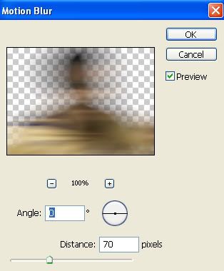
Right, now go to Filter > Blur > Motion Blur and apply these settings;
Now it's time for the main part of the sig; The background.
Duplicate the Motion Blured layer a minumum of 6 times, it all depends on the size of your sig really as the aim here is to cover the background with your blurred renders. Simply adjust each duplicated layer until the background is completley covered. Don't forget, you can duplicate or delete the layers as many times as you want so you can find the right balance.
Hopefully, you should now have a background that looks similar to this;

Now you need to un-hide the main render layer and put it above every other layer so it's now clearly visible like so;

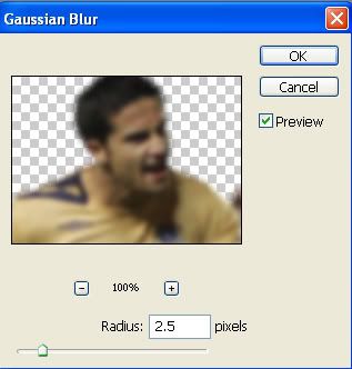
Right, now duplicate the main render layer and set the blending options of that layer to 'Overlay'. Now go back to the previous render layer and go to Filter > Blur > Guassian Blur and apply these settings;
Next, create a new layer and fill it with a colour that best matches your render. For example, Cahill is wearing a yellow shirt in my kit so I used a yellow colour for the fill. Set this layer to 'Overlay' and adjust with the Opacity until your happy with it. NOTE: Make sure this layer goes at the top of all the other layers.
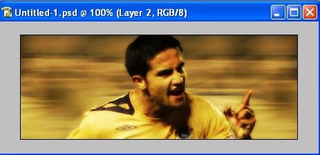
Your sig should now be resembling something similar to this;
Now, for the finishing touches. BEWARE: Save your progress before doing this because it may go wrong at first.
Merge all your background layers and then once murged, duplicate it. On the duplicated layer, go to Filter > Pixelate > Mosaic and use the random settings. Now go to Filter > Sharpen > Sharpen and do that 3 times. Once you've done that, set the layer to 'Overlay' and reduce the opacity to whatever you feel is suitable; I used 40.
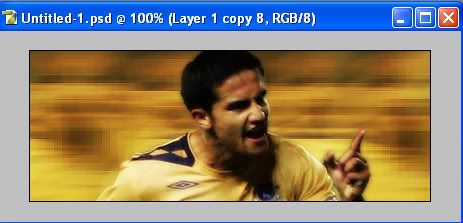
Your sig should now be shaping up into something like this;
Now all you need to do is add some Text and a border and your sig is done.
Don't be scared to experiment with a few brushes as well or slap in a club team's logo like I have.
I'm sorry if I made this tutorial too complicated or hard to follow, I have rushed it a bit so if you have any queries then I will gladly answer them in this thread.
I'd also like to see some outcomes if possible, or is it just too hard?
The aim of this tutorial is to achieve a signature in this style;

It may look complicated, but you'll be surprised with how unbelievably easy it is to make, so let's get cracking. First of all, open up a new document in Photoshop with these settings but you can use whatever size you want. For this tut I will be using 400 x 150;

Go to the paint bucket tool and fill this layer with black and then slap your render on it, for this tut I will be using Tim Cahill. Once you've done that, you should have something similar to this;

Now let's crack on to the serious stuff. Select your render layer and duplicate it once and hide the layer which you duplicated. (Be careful NOT to hide the layer that was produced by the duplicating, but hide the one that you made first instead. In more simple terms, just click the eye on the bottom render layer.)
Right, now go to Filter > Blur > Motion Blur and apply these settings;

Now it's time for the main part of the sig; The background.
Duplicate the Motion Blured layer a minumum of 6 times, it all depends on the size of your sig really as the aim here is to cover the background with your blurred renders. Simply adjust each duplicated layer until the background is completley covered. Don't forget, you can duplicate or delete the layers as many times as you want so you can find the right balance.
Hopefully, you should now have a background that looks similar to this;

Now you need to un-hide the main render layer and put it above every other layer so it's now clearly visible like so;

Right, now duplicate the main render layer and set the blending options of that layer to 'Overlay'. Now go back to the previous render layer and go to Filter > Blur > Guassian Blur and apply these settings;

Next, create a new layer and fill it with a colour that best matches your render. For example, Cahill is wearing a yellow shirt in my kit so I used a yellow colour for the fill. Set this layer to 'Overlay' and adjust with the Opacity until your happy with it. NOTE: Make sure this layer goes at the top of all the other layers.
Your sig should now be resembling something similar to this;

Now, for the finishing touches. BEWARE: Save your progress before doing this because it may go wrong at first.
Merge all your background layers and then once murged, duplicate it. On the duplicated layer, go to Filter > Pixelate > Mosaic and use the random settings. Now go to Filter > Sharpen > Sharpen and do that 3 times. Once you've done that, set the layer to 'Overlay' and reduce the opacity to whatever you feel is suitable; I used 40.
Your sig should now be shaping up into something like this;

Now all you need to do is add some Text and a border and your sig is done.
Don't be scared to experiment with a few brushes as well or slap in a club team's logo like I have.
I'm sorry if I made this tutorial too complicated or hard to follow, I have rushed it a bit so if you have any queries then I will gladly answer them in this thread.
I'd also like to see some outcomes if possible, or is it just too hard?

Last edited:


 :
: