Sky Sports TV Overlay RELEASED !!!

jkartik

Chairman of Selectors
Joined
May 7, 2005
Location
Mumbai,India
Online Cricket Games Owned
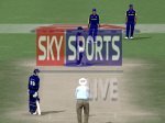
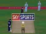
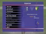
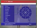
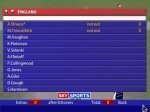
The Moment You All Were Waiting For ! The Much Awaited Sky Sports TV Overlay is Released. :D
Thanx To Aussie1st For His Help and support. :hpraise
and also, thanx to all pc members for their views and suggestions

REPS are always accepted ! ;)

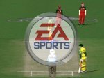
Some Pics Of The Overlay :-

Download HERE
 

Attachments

  • Menu.JPG
    Menu.JPG
    67.4 KB · Views: 543
  • wagon.JPG
    wagon.JPG
    67.5 KB · Views: 514
  • score.JPG
    score.JPG
    75.1 KB · Views: 499
Last edited:
wow mate..looks awesome..its not letting me giv reps cuz i've alrdy given u one..keep it up dude..
 
JK16_4, can you make a patch which hides the window which shows which direction the ball spins or swings? If not, can anybody else- I know that das_vicky knows how to do it as he released a patch for this which is on pg 2 on his thread.

It would be much appreciated as it makes the game more realistic as you don't know how much spin/ swing is applied on the ball. I think it is much more fun that way.
 
Hey JK

I'm loving the new overlay... just one minor improvement that I noticed right off the bat... can you change the EA Sports Logo that comes onto the screen from right to left to Sky Sports Live or something along those lines.. I think it was Prakash or Das_Vicky that's done it before but I'm pretty sure that Aussie knows how to edit that as well... it would be great... btw.... reps for you bro.
 

Attachments

  • for jk.JPG
    for jk.JPG
    88.6 KB · Views: 423
Last edited:
THANX Guys For Your Views and Reps ! :)
really appreciate it.

yes, i also wanted to change that but it failed as it showed but "bizzare" graphics. so i decided to leave it as it will look odd than EA Logo ! :D

anyways, i am trying to fix that and will post a update soon.

Keep em Coming !

hey , i just did a lil tweaking and replaced the EA Logo with this one :)

shall i release it ?
 

Attachments

  • sky logo.JPG
    sky logo.JPG
    94.3 KB · Views: 412
It looks good... maybe if "Live" was centered, it would be better... that's my opinion... I think graphically BF or Aussie and others more familiar with this stuff might have more insight to give... but so far it's a nice template to work on... don't release it till you feel it's as good as it can be ;).
 
I think you should just leave out the Live logo. I don't remember many TV stations putting Live for their flash screen.
 
Looks nice... it would probably look better with the white border being the same size all around or no white border at all.... or am I being too picky for a screen that pops up for 1 second ;)... lol.. also JK... I think the Resume Screen needs more transparency... or you can experiment with having no transparency at all... I'll experiment more and let you know.... Also it looks a little empty beside all the buttons on that screen... just my opinion though... other than that, flawless
 
Last edited:

Users who are viewing this thread

Top