You are using an out of date browser. It may not display this or other websites correctly.
No Requests Sulaiman's Graphics Thread.
- Thread starter Sulaiman7
- Start date
G
gitm
Guest
Very good improvement bro. Go to deviantart, if you have some free time then see those smudge tuts. KIU bro! 

Iamhere
Banned
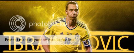
Without text looks better.
Rizwan_zak11
Associate Captain
- Joined
- Feb 4, 2013
Good try. 
IMO without text version stands out, you need to improve on text's and their placements too.

IMO without text version stands out, you need to improve on text's and their placements too.
- Joined
- Dec 15, 2011
- Location
- Chennai,India
I liked the one without the text.Your finishing skills have developed greatly.Kudos for that.
On the other hand,the one with the text,do I see a brush stroke?It is unnecessary.Just the text would've been fine,you can surely improve on that.
Good luck!
On the other hand,the one with the text,do I see a brush stroke?It is unnecessary.Just the text would've been fine,you can surely improve on that.
Good luck!

Sulaiman7
ICC Chairman
do I see a brush stroke?
Yep, that was a brush stroke.

Thank you everyone.

Mukesh.
Banned
Super work man Awesome 


Siddhant007
International Coach
Good Work will be using it
Umair7
El Presidente
AUS..
Ireland
Kings XI
KK
Hobart Hurricanes
Survival Games Finalist
Avengers
Oval Invincibles
- Joined
- Mar 30, 2011
- Profile Flag
- Canada
Good Work will be using it
This was an awkward moment, I thought Sullu commented on his own thread by mistake, but I have to read the name three times.
Anyways those are great, awesome improvement avatar wast the best I feel.
All you need to improve mostly now on is the text.
G
gitm
Guest
Sullu has got his twin bro 
Anyways, i can see that massive improvement while blending textures there. If you have sharpened it, that part was too much. The text looks not good. AND STOP USING THOSE POO's UNDER THE TEXT. Those just turns your great work into a total crap.
KIU bro!

Anyways, i can see that massive improvement while blending textures there. If you have sharpened it, that part was too much. The text looks not good. AND STOP USING THOSE POO's UNDER THE TEXT. Those just turns your great work into a total crap.
KIU bro!

Similar threads
- Replies
- 629
- Views
- 61K
G
Requests Accepted
Sid Graphics - Icon #163
- Replies
- 167
- Views
- 16K
- Replies
- 366
- Views
- 35K
Requests Accepted
EARAgAV | CRICKET16 CONCEPT ART
- Replies
- 420
- Views
- 38K
No Requests
#aravind GFX thread .: Cr7 Wally :.
- Replies
- 952
- Views
- 114K
Users who are viewing this thread
Total: 1 (members: 0, guests: 1)


