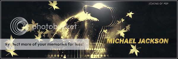
Requests Accepted .:KOP's Graphics Thread:.Michael Jackson sig[My best]|Thanks to AHAD|

What i am best at?


  • Total voters
    7
Status
Not open for further replies.
Nice wallpaper. Some parts of texture is in low quality but that's okay. Not really liking the render and thanks for credit. Text is quite good this time.

I have used Gaussian blur that would be the reason for the low quality,Anyway thanks for the comments.
 
Last edited:
Michael Jackson Avatar:-

MJAVA.jpg


Michael Jackson Signature:-

Awesome.jpg
 
Last edited:
Its okay. I don't like the text at all here. It just looks completely off, and stands out too much. The sig itself is way too dark, and some things are hard to see. You've also done way too many things to the render itself. Not one of your better pieces.
 
Not a good signature at all just simple brush effect around a black background and just a simple text not your best at all.
 
I like the effect on render. The idea of maple leaves is not good, sparkling brushes would've been better. Also add some effects on the text.
 
Status
Not open for further replies.

Users who are viewing this thread

Top