You are using an out of date browser. It may not display this or other websites correctly.
Idk but my brain thought it as empty stadium seats on a jersey when I looked at it closely.
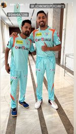
Rising Pune Supergiants jersey looks good now in front of this.
Actually, I am quite happy with a fresh color and design on the jersey. I was half expecting them to re-use the Pune Super Giants one, but this is a welcome addition as most of the teams have varying shades of dark blue and red.
B
Bigby Wolf
Guest
The ugliest jersey ever.
The local 100 rs. Jersey looks better than this shit.
AliB
ICC President
India
AFG...
Mumbai Indians
PlanetCricket Award Winner
Adelaide Strikers
X Rebels
Color is good but absolutely no design, or at least something which is not visible to us. Their training kit looks far better imo.
- Joined
- Nov 3, 2017
- Location
- India
- Profile Flag
- India
- Online Cricket Games Owned
- Don Bradman Cricket 14 - Steam PC
Read this on twitter and you know why the 20% work left because they didn't hired a good graphic designing team"If you hire right people for right job, 80% work is done." - Lucknow Supergiants owner
B
Bigby Wolf
Guest
I think it might look good on tv from far away.
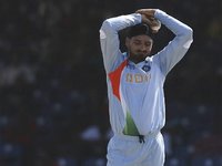
The training kit looked quite good - looking at the pic of Rahul batting in the nets. That jersey looks shite though. The orange and green (assuming it's the tri-colour from the Indian flag) completely ruin the look of the jersey, along with that ugly yellow logo below the collar.
Why is Shabaaz Nadeem giving out bolo zubaan kesari vibesView attachment 265498
My eyes after seeing the full jersey are bleeding.
Looks more horrible in reality.
I don't mind the colour. It's a change from those boring colours we have seen these many years. However, not liking the brick like structure overlay over the cloth.
- Joined
- Jan 1, 2013
Surely there are better way to incorporate tricolorThe training kit looked quite good - looking at the pic of Rahul batting in the nets. That jersey looks shite though. The orange and green (assuming it's the tri-colour from the Indian flag) completely ruin the look of the jersey, along with that ugly yellow logo below the collar.
B
Bigby Wolf
Guest
Sasta Nawazuddin Siddiqui.Why is Shabaaz Nadeem giving out bolo zubaan kesari vibes
Similar threads
- Sportsbook Event
- Replies
- 2
- Views
- 617
- Sportsbook Event
- Replies
- 2
- Views
- 732
- Sportsbook Event
- Replies
- 2
- Views
- 598
- Sportsbook Event
- Replies
- 2
- Views
- 649
Users who are viewing this thread
Total: 1 (members: 0, guests: 1)


