@Jk,
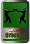
Here is the corrected version of Olive Green

Wow That nice Hitterman

Last edited:
@Jk,
Here is the corrected version of Olive Green
")
 Of course I'd expected concept masterworks from Pranav, KBC and LC, and they delivered, but some of the new guys have made stunning stuff as well! I have a feeling that you take the good bits from a few different designs and a very good one can come up.
Now that is what I was looking for. It looks neat, and the text looks good as well. I am sending you the bigger version of the silhouette. It'd be much better if you replace it with the current one you've used.I couldn't really upscale it well, so just vectorised it (not something I'm very good at). Couldn't do the swoop right as a vector so changed that a bit. Needs a bit of a touch up in a few areas, but otherwise, I think it is brilliant.
View attachment 66472
@Shrenik - really good - your best to date - very professional. Only issue I have with it is it's more suitable maybe for a competition logo, like a world cup or somethingBut I'm certain we could use it somewhere in the game, definitely.
could you please suggest some changes so as to get rid of the 'world cup' logo look