You are using an out of date browser. It may not display this or other websites correctly.
New TAOC logo needed!
- Thread starter legend_master
- Start date
Aoun13
Chairman of Selectors
- Joined
- Apr 2, 2008
- Location
- Rawalpindi (Pak)
- Profile Flag
- Pakistan
- Online Cricket Games Owned
- Don Bradman Cricket 14 - Steam PC
^^ I think you too much play ICC, so every thing looks ICC for you.
After sketching all that, I personally feel it looks unique, no resemblance to any game or site.
After sketching all that, I personally feel it looks unique, no resemblance to any game or site.
legend_master
The Art of Cricket Developer
Hi everyone,
Am thinking of wrapping this up by the end of this week (Friday), so please make sure to get entries in by then. Some really great work still rolling in.
@Send2yaari - your logo is great - very professional. But I do have to agree on the ICC comment - the batsman silhouette looks awesome and overall the design is great, only problem is the bouncing ball and trail - it is very ICC....
@Hitterman - much better after toning down the grass detail
@Holmie - Great logo, as we expect from someone with your skills and talent. Only prob is I agree with JK, not really cricket related, more of a modern art masterpiece Would love to see another more cricket-related effort from you.
@KBC - still waiting for that master logo
@Tom/ Pranav - probably still the ones to beat imho
Am thinking of wrapping this up by the end of this week (Friday), so please make sure to get entries in by then. Some really great work still rolling in.
@Send2yaari - your logo is great - very professional. But I do have to agree on the ICC comment - the batsman silhouette looks awesome and overall the design is great, only problem is the bouncing ball and trail - it is very ICC....

@Hitterman - much better after toning down the grass detail
@Holmie - Great logo, as we expect from someone with your skills and talent. Only prob is I agree with JK, not really cricket related, more of a modern art masterpiece
 Would love to see another more cricket-related effort from you.
@KBC - still waiting for that master logo

@Tom/ Pranav - probably still the ones to beat imho
AbhishekS
Chairman of Selectors
- Joined
- Dec 10, 2008
- Location
- Mumbai, India
- Online Cricket Games Owned
- Don Bradman Cricket 14 - Steam PC
kunalverma25
School Cricketer
Here's one..........


Aoun13
Chairman of Selectors
- Joined
- Apr 2, 2008
- Location
- Rawalpindi (Pak)
- Profile Flag
- Pakistan
- Online Cricket Games Owned
- Don Bradman Cricket 14 - Steam PC
Hi everyone,
Am thinking of wrapping this up by the end of this week (Friday), so please make sure to get entries in by then. Some really great work still rolling in.
@Send2yaari - your logo is great - very professional. But I do have to agree on the ICC comment - the batsman silhouette looks awesome and overall the design is great, only problem is the bouncing ball and trail - it is very ICC....
@Hitterman - much better after toning down the grass detail
@Holmie - Great logo, as we expect from someone with your skills and talent. Only prob is I agree with JK, not really cricket related, more of a modern art masterpieceWould love to see another more cricket-related effort from you.
@KBC - still waiting for that master logo
@Tom/ Pranav - probably still the ones to beat imho
so last option is removing bounce and ball trail.should I remove it?
Cricket-Duke-31
School Cricketer
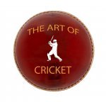
New Logo
TAOC LOGO
INDIA VERSION

DEFAULT VERSION

INDIA VERSION

DEFAULT VERSION

nakul
School Cricketer
I'll post my first attempt tomorrow.
Cricket-Duke-31
School Cricketer
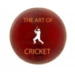
Another One


arjind
International Coach
- Joined
- Feb 3, 2009
- Online Cricket Games Owned
TAOC LOGO
INDIA VERSION

DEFAULT VERSION

Change colours and text and you could be one to a winner
arjind added 1 Minutes and 26 Seconds later...
so last option is removing bounce and ball trail.should I remove it?
Try an arc, something a bit more unique
arjind added 0 Minutes and 35 Seconds later...
so last option is removing bounce and ball trail.should I remove it?
Try an arc, something a bit more unique
gocricketgo
School Cricketer
- Joined
- Jan 7, 2009
- Online Cricket Games Owned
arjind
International Coach
- Joined
- Feb 3, 2009
- Online Cricket Games Owned
Here's one..........
More like a sig, too detailed for a logo
Aoun13
Chairman of Selectors
- Joined
- Apr 2, 2008
- Location
- Rawalpindi (Pak)
- Profile Flag
- Pakistan
- Online Cricket Games Owned
- Don Bradman Cricket 14 - Steam PC
Here are my two of my versions and ICC one, tell me the resemblance and what sort of changes I must do.
Version 1:

Version 2:


Version 1:

Version 2:


legend_master
The Art of Cricket Developer
@send2yaari - it's the bouncing ball that's the problem...apart from that it is awesome.
AngryPixel
Chairman of Selectors
- Joined
- Jul 28, 2009
- Location
- Mumbai, India
- Online Cricket Games Owned
- Don Bradman Cricket 14 - PS3
- Don Bradman Cricket 14 - Steam PC
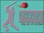
You should replace it with a ball having trail like a comet or a fire shaped. Anything but the bouncing ball

Similar threads
- Replies
- 9
- Views
- 2K
- Replies
- 11
- Views
- 2K
- Replies
- 191
- Views
- 37K
- Replies
- 93
- Views
- 14K
Users who are viewing this thread
Total: 1 (members: 0, guests: 1)


