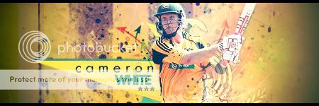
Definitely a fair effort, nice blending although the text and triangle don't really fit in
The BG doesn't fit in with the triangle, it's 2 styles in one sig
The triangle thing looks sleek and neat whereas the BG is more of a grungy, rough effect
Also those brushes (textures?) on White, don't fit in either
It's hard to put text in these type of sigs, a good approach but it doesn't really fit in
I sounded like a pro there lol
Meh, we're all noobs tbh, helpin each other out
MaD added 1 Minutes and 29 Seconds later...
Aditya shoulda put in a better start too
Render placing wasn't good, no sign of blending, although it's just a start, fair finish


")
 :crying
")

 :
:


