You are using an out of date browser. It may not display this or other websites correctly.
PuLee's Gfx Megastore - Stuffs++
- Thread starter RPHKR
- Start date
- Joined
- Dec 15, 2011
- Location
- Chennai,India
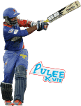
For something a year later..Thats an excellent effort.You could've worked on the Background,texture use and the stroking..but never mind.
Welcome back again!
Welcome back again!

G
gitm
Guest
That is really good, needed a nice BG which is your common fault.Font looks cool in that. KIU 

RPHKR
National Board President
That is really good, needed a nice BG which is your common fault.Font looks cool in that. KIU
Haha what a bump!

----------
needed a nice BG which is your common fault
I'll improve on that.

FC Akash.
International Cricketer
Requests on for logos, banners, signatures and avatars.
I am back.
Good work on sandeep siggy but text

Renders looks good
Earagav
International Coach
Renders and Bale look far better than sandy.
In sandy a white text would be good.
In sandy a white text would be good.
Paree
Panel of Selectors
Love That Banner.Like all said text can be improved.Nice Cut as well.KIU

Mukesh.
Banned
TheNameisNiru
Panel of Selectors
- Joined
- Nov 20, 2011
- Location
- Bangalore,India
- Profile Flag
- India
- Online Cricket Games Owned
- Don Bradman Cricket 14 - Xbox One
edges in the render's could have been smooth
Sathish_kumar
Associate Captain
- Joined
- Aug 27, 2011
- Location
- Tamil Nadu,India.
- Online Cricket Games Owned
- Don Bradman Cricket 14 - Steam PC
The banner looks good. also bale siggy looks pretty nice. steyn render's cheek part need a bit improvement. btw your renders looks too sharp. just give feather radius 0.3 or 0.4 pixels,when you cutting the render. it will look fine.

Last edited:
Similar threads
No Requests
Rudi's GFX - Sunrisers Wallpaper #80
- Replies
- 80
- Views
- 12K
Users who are viewing this thread
Total: 2 (members: 0, guests: 2)


