Your Player Cards

Hmph!! Never mind then. LOL


I will check your symonds out later in the day.

Haha sorry, all those players are etched into my brain, my golden age of cricket if you will.

3VHDzS5.png

to save looking me up on CA here's my roy

I have a mcgrath that came out similar to your's, but mine looks like an angry old man, you look like your on the right path :p.

Fissionmailed on CA, Feel free to tinker with my players :D, I'll get back into it sooner to release.
 
Last edited:
Haha sorry, all those players are etched into my brain, my golden age of cricket if you will.

3VHDzS5.png

to save looking me up on CA here's my roy

I have a mcgrath that came out similar to your's, but mine looks like an angry old man, you look like your on the right path :p.

Fissionmailed on CA, Feel free to tinker with my players :D, I'll get back into it sooner to release.

If you made the nose and ears pretty much the same length (if anything ears slightly longer) and the nose thinner then it'd be spot on!
 
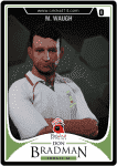
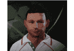
this is a WIP of steve and mark waugh...to be honest they are not even close. incredibly difficult to create both waughs. but suggestions are welcome.....

steve:
n118.png


mark
uwcl.png
 
Last edited:
Without even attempting to create the Waugh brothers, I can already imagine how tough they are to create given how they look at the nature of the Academy. I think they're going to be players where you have to accentuate the unique characteristics more than you usually would? Maybe make Steve's eyes a bit more squinted...maybe try a different hair style too?
 
snowy....i updated that postwith mark too.

you are right about the squint part. i should try that. funny thing is steve does not squint indoors. he seemed to squint under the sun a lot for some reason and that's how i guess most people remember him

----------

Instead of worrying about the hair which will either be under the cap or the helmet (assuming you dont make him bowl him due to his back pain!) i edited some more and honestly think this actually reminds me a bit of steve....a bit!:p


7vxw.png
 
They're both just weird looking people...

Mark should almost have a comically large nose..and his head seems a bit small? Maybe even try one of the mullet hairstyles to see if that helps? I find mixing up the hairstyles during the creation can give you a different perspective on different parts of the face

Edit: I certainly like the capped version a lot more! Something about the eyebrows/eyes is just slightly off. Definitely on the way though.
 
That last one is a great Steve Waugh, it's meant to be Steve right? Haha :p. Mark is incredibly hard to do, I've been working on one since I got CA since he's my favourite player since I was a kid. Not sure how I feel about mine, I've kind of given up at this point because he has such an odd face. It seemed like every picture I looked at of him his eyes were different, some round, wide and droopy in others, to damn hard!

Edit: now that I look at it that latest pic seems like a good staring point for both, keep with it! We need a good Waugh brothers set.
 
Last edited:
Again, Kasbian you've got the eyes spot on. Really pulls the whole creation together.

Ponting is certainly a player you're more used to seeing with squinted eyes - facial structure looks spot on though
 
Last edited:
Good ponting Israr, instantly recognizable. No offence, but I think the eyes belong to Praveen Kumar :)
 
Eyes are great. You need to increase the chin length a bit, decrease the width of the head and reduce the length of nose a little. That would be ideal. :thumbs
 

Users who are viewing this thread

Top