Your Player Cards

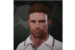
An attempt at Luke Wright.

Luke Wright? Luke Wrong more like...:p

I prefer this one by (superfreddie)


htL24K8.png
 
I think we've already established you like wrongly proportioned, exaggerated caricatures for your players

No, I am not a fan of anything created by blockerdave ;)
 
The mouth is really the only exaggerated feature. Nothing wrong with multiple versions.
 
The mouth is really the only exaggerated feature. Nothing wrong with multiple versions.

I'd also say nose and philtrum - BUT it's whatever floats your boat and is totally subjective. If you like the caricature style then you go with that; if you like the more subtle approach then you go with that. Both equally valid and both equally as good.

I agree, the more creations there are the better.
 
It would be interesting to see the body types attached to each player as realistically this will be what mostly identifies a player to us when we are playing the game - we will most likely rarely see the individual nuances on a players face other than in replays.
 
That's probably something we won't really be able to tell until we have the game. Of course we can guess and make adjustments at this stage, but the extent to which similarities/differences will be easily seen on the field is kinda difficult to dictate at this stage.
 
It would be interesting to see the body types attached to each player as realistically this will be what mostly identifies a player to us when we are playing the game - we will most likely rarely see the individual nuances on a players face other than in replays.

I've made all my players the correct height and have tried to give them a fairly accurate 'body type' too.
 
^wow, after seeing that i realize why you guys keep talking about getting the rating balanced in CA
 

Users who are viewing this thread

Top