You are using an out of date browser. It may not display this or other websites correctly.
3d models for TAOC
- Thread starter _Nabeel_
- Start date
_Nabeel_
Club Cricketer
No problem Buddy

_Nabeel_
Club Cricketer
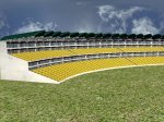
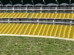
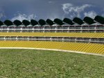
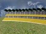
Preview of South African's Wanderer stadium Main Stand:
All the textures are made by me except the glass one,but the text on it is of mine....
so please comment on the model + textures so that I can improve it....
Preview:
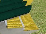
All the textures are made by me except the glass one,but the text on it is of mine....
so please comment on the model + textures so that I can improve it....
Preview:
Attachments
Paki007
Panel of Selectors
- Joined
- Sep 3, 2009
- Location
- Lahore, Pakistan
Very nice work but try to improve the seats
AsadAbrar
International Coach
Great model, you just need to make the lower part of the grill, somewhat indwards.
@jkarthik
I made some models at sketchup, should i show them here?
@jkarthik
I made some models at sketchup, should i show them here?
Thanks for the comments mate.. Will make the changes in the final version...zaxotes : wow! awesome work! but i think the front part of the protection is too front...
Coolboy12 : Great model, you just need to make the lower part of the grill, somewhat indwards.
Great Work & Nice to see people helping in making this game as realistic as possible
dhump
Club Captain
- Joined
- Jul 1, 2009
- Location
- Germany
- Profile Flag
- Pakistan
- Online Cricket Games Owned
- Don Bradman Cricket 14 - PS3
- Don Bradman Cricket 14 - Steam PC
Preview of South African's Wanderer stadium Main Stand:
All the textures are made by me except the glass one,but the text on it is of mine....
so please comment on the model + textures so that I can improve it....
Preview:
Looks not bad I think the tiling of the chairs need to be increase in proportion to the stand the look huge also check the mapping of the grass (I guess its only for giving the idea but not the final one then its ok just increase the tiling so we can get better idea of the final outcome)
I would suggest to make the glass texture seamless currently the seams are quite visible and looks odd.
----------
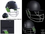
Hi guys,
Tried helmet model for TAOC. its around 700 poly
Have a look...

poly count can be reduced...
Sweet Stuff texture is nicely optimized I would suggest trying to cut down the poly count may be doing the nets by Alpha mapping ?
Secondly the size of net is a bit bigger in comparison to the refrence image same with the sunshade my be its just me or the FOV of camera but I feel that way some how.
Last edited:
_Nabeel_
Club Cricketer
Hello mates,
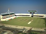
Just to make you know that TAOC is not on halt and that the progress is going on,I am posting this development shot of the Lords Stadium(WIP).I have completed it about 40% but I am not posting the pic of one extra stand due to some glitches.
Note:I have used VRay lighting in which I am not an expert,so the pic may look bright in some areas plus,the shadows are not good.The game will be using mental ray baked texture,so the quality of the stadium in-game should be better than this one...
I have used the map as the ground and not the grass because this is a developmental shot,not the screenshot of the stadium.

Good Day!
Just to make you know that TAOC is not on halt and that the progress is going on,I am posting this development shot of the Lords Stadium(WIP).I have completed it about 40% but I am not posting the pic of one extra stand due to some glitches.
Note:I have used VRay lighting in which I am not an expert,so the pic may look bright in some areas plus,the shadows are not good.The game will be using mental ray baked texture,so the quality of the stadium in-game should be better than this one...
I have used the map as the ground and not the grass because this is a developmental shot,not the screenshot of the stadium.

Good Day!

Attachments
Last edited:
Dipak
ICC Board Member
Wonderful attempt Nabeel. Looks great even though it's completed only 40%. 

That looks really good to me. The shadows (of a stand) on the playing surface to the right are one of the best things about it.
Just a few criticisms ranging from the potentially constructive to the trivial.
1. The white rectangular patch below and towards the right of the wicket area: what is that, the covers?
2. Four or five black patches and one white patch on and around the wicket area: don't like the look of those
3. Is the playing area too small in proportion to the pitches? Certainly the leftmost pitch is really really close to the boundary signage.
_Nabeel_
Club Cricketer
That looks really good to me. The shadows (of a stand) on the playing surface to the right are one of the best things about it.
Just a few criticisms ranging from the potentially constructive to the trivial.
1. The white rectangular patch below and towards the right of the wicket area: what is that, the covers?
2. Four or five black patches and one white patch on and around the wicket area: don't like the look of those
3. Is the playing area too small in proportion to the pitches? Certainly the leftmost pitch is really really close to the boundary signage.
Hehe?That?s not the 3d work.Its a 2D image of the map of lords stadium which I am using for reference,Nothing else?The shadows,covers,pitch,ground you are seeing is the in the real photo :P .BTW we will be trying our best to render out best lighting and shadows so that it looks realistic.
Similar threads
- Replies
- 93
- Views
- 14K
- Replies
- 9
- Views
- 2K
- Sticky
- Replies
- 397
- Views
- 108K
Users who are viewing this thread
Total: 2 (members: 0, guests: 2)

