You are using an out of date browser. It may not display this or other websites correctly.
Chaits Graphics: More avatars.:)
- Thread starter Ohm
- Start date

Dipak
ICC Board Member


Nah  Your old cover was way better!
Your old cover was way better!
G
gitm
Guest
text positioning wasnt good. a reflection of your text can make it look better imo... good work nonetheless.")
Mukesh.
Banned
Nice One
- Joined
- Aug 29, 2012


- Joined
- Dec 15, 2011
- Location
- Chennai,India
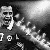
They are brilliant ChaitS.colours are looking good,placement is fine.
Btw how did Alexis become Alexix?..correct it.
Btw how did Alexis become Alexix?..correct it.

Brilliant! Please give me the stock used in Persie icons!
Siddhant007
International Coach
Awesome Work
Mukesh.
Banned
Awesome bro 
G
gitm
Guest
RVP needs vast improvement on its text. Some textures can make it better too.
Rest are awesome. JUST tweaking AWESOME
Rest are awesome. JUST tweaking AWESOME
- Joined
- Aug 29, 2012
RVP needs vast improvement on its text. Some textures can make it better too.
I purposively made it simple, just to impress by text and not by its effects. First I had uploaded it without any effect, but later changed with some gradient as it was dull.
sos
International Coach
Neymar Avvy or Muller siggy?
- Joined
- Aug 29, 2012
Neymar Avvy or Muller siggy?
'and' or 'or'? Accepted anyway.
ParkedTheBus
International Coach
The RvP ones are fantastic
Similar threads
- Replies
- 12
- Views
- 2K
- Replies
- 20
- Views
- 3K
Users who are viewing this thread
Total: 1 (members: 0, guests: 1)