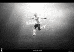
Exceptional! Use of textures is just wow. Just reduce the intensity of the light over his face, or just remove the light from face leaving the light on his head as it is(I'd say reduce that too) and it would be a lot better looking.
Not your best! Textures are nicely placed, but some textures are looking LQ. Somewhere or the other place looks LQ, font selection is not great. Just remove those textures over his face, and it would be a lot better.
This site uses cookies to help personalise content, tailor your experience and to keep you logged in if you register.
By continuing to use this site, you are consenting to our use of cookies.