Your best Work till now shrenik....
Tough competant for LC
")
thanks nabeel
shrenik added 0 Minutes and 28 Seconds later...
And mine, everyone loves mine
i second that
")
Your best Work till now shrenik....
Tough competant for LC
And mine
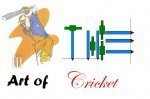
Since you mentioned the word art in your title, i present to you all my first and last logo.
My logo's unique colours:
Blue - represents the blue sky,
green - represents the greeny grass,
brown - represents the browny pitch,
red - represents the red ball.
I hope you all will atleast like it. And please do not post bad comments. I am frightened of getting banned. Please................
bit too busy and the cricketer lacks vibrance and saturation, definetly needs editing and shouldn't have to be explained
sorry mannn i just imagined it only in the mind of an artist. I know it must be colourful, should have borders, etc, etc, blah blah blah......................
Since you have so many suggestions, why don't you try and do it????????????? {{ USING A PENCIL AND ON PAPER }}
Then only you will suffer the pain.
It was just a plain try.
And not an extraordinary like u all genius people in this forum.
If you like it appreciate it, or else don't comment, please.........
If you have the dare to comment, go and do that yourself. Then you will know the pain.
AND ONE MORE THING, I AM A CRICKET LOVER, AN INDIAN, I LOVE THE GAME AS MUCH AS YOU LOVE, I KNOW CRICKET {A-Z} FULLY.
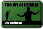
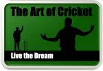
2 completely new versions of my logo
do it using a pencil and on paper. Then only you will know it. Not using these photoshops, paint, and etc softwares.

2 completely new versions of my logo
Arjind I relly like your these new logos with bowler and umpire