Pradi's/Prakastic Downloads - Afterlong time... ???

Extract the files given in the download into C:/Program Files/Steam/steamapps/common/cricket revolution/system/data, using a program such as WinRAR or WinZIP. So you will have a "Shapes" file in the data folder.

I agree with hari, Australian yellow kit is much better :( .
 
Hi guys,

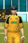
I am in making of the Australian Yellow jersey, it is one of the toughest kit i have ever made. Have look almost finished some minor work remains...
attachment.php


So thought of giving you the home team kit for you guys to use. It make have some error so please ignore it.

DOWNLOAD AUSTRALIAN HOME KIT
Comments are welcomed.
 

Attachments

  • Australia.rar
    702.3 KB · Views: 111
  • aus yel.jpg
    aus yel.jpg
    45.9 KB · Views: 243
Hi Guys,

Have a look at this i had given a try at logos.
attachment.php

attachment.php

attachment.php

attachment.php

comments are welcomed about the logos....
 

Attachments

  • 1.jpg
    1.jpg
    47 KB · Views: 229
  • 2.jpg
    2.jpg
    45.9 KB · Views: 225
  • 3.jpg
    3.jpg
    47.1 KB · Views: 224
  • 4.jpg
    4.jpg
    47.5 KB · Views: 219
why is there text on lanka, australia & bangladesh but not the others? i reckon they look better without the text...

anyway, those logos are really nice looking... very professional =D
 
Thanks for all the comments...
jb the badsign: why is there text on lanka, australia & bangladesh but not the others? i reckon they look better without the text...

anyway, those logos are really nice looking... very professional =D
Its because these logos are made for EA Sports Cricket 07 by me a long ago. i digged it from my PC. There are two versions with name and without name but lost some source files. So that only i have missed them.:D

coolz_hari : great logos but please don't write anything on logos
While released the logo will not have the names.;)
 
Hi guys,

I have redone the logos have a look.Please comment on them...
will release them soon....
64933d1260237126-pradis-prakastic-downloads-international-kit-pack-01-rs-mf-new-logo-pack-preview-have-look-logopre.jpg
 

Attachments

  • logopre.jpg
    logopre.jpg
    74.2 KB · Views: 158
My thoughts:

-I think Australia's Union Jack should be slightly more visible, so maybe move it down a touch and also the southern cross down a touch.

-Bangladesh's red dot needs to be bigger.

-Pakistan's green should be greener.

-I don't like Sri Lanka being horizonatal.

-West Indies needs to be bigger.

-England's cross should be different. On England's flag, the horizontal cross is obviously bigger, but here the vertical cross is bigger.

Sorry for all the nitpicks :p . These logos are very classy, just a few small things.
 
pretty good and quality work but i guess the red circle in the bangladesh logos could had been bigger
 

Users who are viewing this thread

Top