Pranav's Graphics Thread

What am I best at?


  • Total voters
    153
@gazza_11-maybe this is pranav's thread right?

No one said I'd post them here

I'll probs pm them straight to Madhur ;)

Gazza_11 added 2 Minutes and 52 Seconds later...

Let Gazza have a go at them, 'coz I am a bit busy these days.
I thought you guys would never come to know this. This is Whitehornmatt's graphics thread. Infact, the account PranavPathak is a multiple account created by me. (WHM being my fist one.) Though, being an Admin I am easily able access the two accounts without anyone suspecting me. I'm really amazed at how Skrillex_x managed to get it right, and hence was able to identify that Pranav and Whitehornmatt are the same person.


Wow I'd never have picked that. No offence but I assumed White Horn Matt was a pom or something :doh
 
First improve your english mate then point out others.

Shut up you prick, I wasn't pointing out his 'errors', I was actually backing him up and telling skrillex why it might not make sense to us..
 
PCGMOTW Entry (with slight edits) :

Harbhajan1.jpg
 
Naw, this is very unlike you. Maybe a perfect grayscale might be better. You black/whited it? Or added a gradient map and put it beneath a blue layer or something? The sharp bokeh textures idea is good but you could've done a lot better with the adjustments. The text idea is getting repititive, you see, text is something you can make flow with the work, instead of being a sign to tell something. But the render effects are nice at places.

You know pranav, you can do a lot better, but it's last week, hope there's a big bomb awating to blow us all this time! ;)

Keep it up.
 
You don't actually know how good it looks like unless it's pure grayscale nick.
 
Request:-Can you make a Sourav Ganguly Wallpaper with 1280*800,With fire effect,as you made fo shane watson sig?

If you are free now,then can you do this request?
 
Naw, this is very unlike you. Maybe a perfect grayscale might be better. You black/whited it? Or added a gradient map and put it beneath a blue layer or something? The sharp bokeh textures idea is good but you could've done a lot better with the adjustments. The text idea is getting repititive, you see, text is something you can make flow with the work, instead of being a sign to tell something. But the render effects are nice at places.

You know pranav, you can do a lot better, but it's last week, hope there's a big bomb awating to blow us all this time! ;)

Keep it up.

My only complaint was the text.

I disagree with KBC about the Grayscale. The added blue works better here.

You don't actually know how good it looks like unless it's pure grayscale nick.

True but I won't lie. I'm not a fan of B&W sigs. :p

Contrasting views there. I liked the one with the blue tinge on it.

Can i Request a C.Ronaldo and W.Rooney Wallpaper(Together in One Wally)

Sure.

If you are free now,then can you do this request?

I can't guarantee anything, but I'll see.

________________________________________

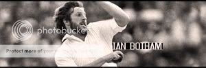
Dutchad's request :

Botham.jpg
 
Contrasting views there. I liked the one with the blue tinge on it.


Sure.


I can't guarantee anything, but I'll see.

________________________________________

Dutchad's request :

Botham.jpg


Darn it! I can't view it! I only see a red cross where the picture should be! What to do? Any ideas?
 

Users who are viewing this thread

Top