You are using an out of date browser. It may not display this or other websites correctly.
Requests Accepted Rizwan Graphics | New stuffs + Mahrez Sig ;)
- Thread starter Rizwan_zak11
- Start date
Brilliant work!
Rizwan_zak11
Associate Captain
- Joined
- Feb 4, 2013
Mesut looks lovely! Needs a bit finishing,pass it over?
Brendon looks ok,the double render could have been worked with better. Focal,get it more often!
Sorry Anish bro I forgot to save .PSD .
Rizwan_zak11
Associate Captain
- Joined
- Feb 4, 2013
Great with text, lightning and all.You're a legend my dear bro.
Mind making one Pollard avatar?
In.

Rizwan_zak11
Associate Captain
- Joined
- Feb 4, 2013
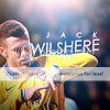
Made this Ava by following the Tut of @assofty pretty happy with this outcome..

And a Januzaj Sig.

Comment's are most appreciated. Also give me some suggestion's about areas which you think that I must improve.

And a Januzaj Sig.

Comment's are most appreciated. Also give me some suggestion's about areas which you think that I must improve.

----------
Arsene Wenger Cristiano Ronaldo Carlo Ancelloti
PSD's for learning purpose (Long back).
Sulaiman7
ICC Chairman
I can observe a few textures not integrated thoroughly. Text isn't glancing satisfactory as well. Because of so many textures, the discernability and clearance (sharpness) of the render has curbed. Avatar is top-notch. KIU! 

FC Akash.
International Cricketer
Great ava But siggy 
Sullu said it all

Sullu said it all
Anish.
Panel of Selectors
- Joined
- May 21, 2011
I can observe a few textures not integrated thoroughly. Text isn't glancing satisfactory as well. Because of so many textures, the discernability and clearance (sharpness) of the render has curbed. Avatar is top-notch. KIU!
This
Avatar is nice but could do with better text.
The sig is overdone,keep it simple.

Rizwan_zak11
Associate Captain
- Joined
- Feb 4, 2013
@ChaitS request done, and sorry for being late.


Sulaiman7
ICC Chairman
Observing the stock, the text was futile. The harmonizing of colours in both avatars is not done adequately. Terry one desired just a dose (0.1) of exposure I conclude. The stock deployment in Pollard one isn't expressing satisfactory as well. KIU, withal!
Similar threads
- Replies
- 39
- Views
- 6K
K
- Replies
- 1K
- Views
- 105K
Requests Accepted
HiTtErMaN's NeW ImPrOvEd QuAlItY GrApHiCs - LEE SIG RELEASED
- Replies
- 35
- Views
- 3K
- Replies
- 278
- Views
- 21K
- Replies
- 299
- Views
- 22K
Users who are viewing this thread
Total: 2 (members: 0, guests: 2)


