You are using an out of date browser. It may not display this or other websites correctly.
That wasn't the issue - the Staff usergroup had the profile picture limits set lower than the regular users, probably because we've never really made a decision on how big they should be because very few people actually use profile images.
A reminder that everything on your profile needs to comply with the forum rules - including the status updates, any images (including those in albums) and your use of visitor messaging. Features can be disabled or bans/infractions given for misuse.
A reminder that everything on your profile needs to comply with the forum rules - including the status updates, any images (including those in albums) and your use of visitor messaging. Features can be disabled or bans/infractions given for misuse.
Abhas
Retired Administrator
- Joined
- Aug 6, 2004
- Location
- New Delhi, India
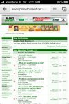
Sorry for being a pain, but on the iPhone, the menu is now exceeding to 2 lines, with logout moving to a new line, under usercp.
Although it doesn't look too bad, but its easy to keep hitting logout instead of usercp which can be irritating.
----------
@matt, but Simon's getting only 100x100, so surely there is something wrong? I'm getting 250x250.
Simon, could you check again?
Although it doesn't look too bad, but its easy to keep hitting logout instead of usercp which can be irritating.
----------
@matt, but Simon's getting only 100x100, so surely there is something wrong? I'm getting 250x250.
Simon, could you check again?
Give that a go now.Sorry for being a pain, but on the iPhone, the menu is now exceeding to 2 lines, with logout moving to a new line, under usercp.
What is missing from the mobile style that stops you using that on a phone instead of the full site?
He can't set his own permissions, so no, there's nothing he can do about it.He's a staffie , so I'd expect Simon to sort out the problem unless there needs to be something done through the Admin CP .
I changed the settings for his usergroup before I posted, so he can check if that has fixed the problem when he next comes on.
SiriusBlack
ICC Chairman
edited
Abhas
Retired Administrator
- Joined
- Aug 6, 2004
- Location
- New Delhi, India
Give that a go now.
The logout is now being covered by the icons. The icons are set as a relative position to the right.. If you resize your desktop browser, the icons will simply keep moving to the left and would cover the menu items, while, ideally they should simply stick next to the search bar even if the screen is resized.
What is missing from the mobile style that stops you using that on a phone instead of the full site?
Actually, I haven't really tried it ever. I'm so used to the desktop style, and the fact that I regularly use the desktop, iPad, and iPhone for browsing, it is very pleasing to me that I see the same thing everywhere.
I've tried some code to just hide those on the mobile sized screens. I haven't got any iOS devices to test on, so if you could post a screenshot of how it looks now that would help.The logout is now being covered by the icons. The icons are set as a relative position to the right.. If you resize your desktop browser, the icons will simply keep moving to the left and would cover the menu items, while, ideally they should simply stick next to the search bar even if the screen is resized.
Which is part of the reasoning for the recent changes, I want to make the site a more constant experience whether you've viewing the front page or the forums, desktop or mobile.Actually, I haven't really tried it ever. I'm so used to the desktop style, and the fact that I regularly use the desktop, iPad, and iPhone for browsing, it is very pleasing to me that I see the same thing everywhere.
A new feature some might like has been added - if you have subscribed to a social group, their discussions will show at the bottom of the forum index.
To subscribe to a group, go to it - click the 'Group Tools' link in the Social Group Discussions section - and choose 'Subscribe to This Group'. From there you'll probably want the no notification option.
Subscribed groups will also appear in your User CP, but that box is collapsible if you don't like them there.
The reason it is like this is so that you can pick and choose which of the social groups who have discussions you wish to pay attention to (like a league you are in), instead of having a long list of everything you've joined there.
Abhas
Retired Administrator
- Joined
- Aug 6, 2004
- Location
- New Delhi, India
Abhas
Retired Administrator
- Joined
- Aug 6, 2004
- Location
- New Delhi, India
If you ever need to add anything else onto the menu, you can consider moving the logout button/text to the very top, near private messages, or near last visited.
It probably makes sense next to the welcome text. Then again, who needs to log out anyway?
vaibhavtewatia
Panel of Selectors
I am sure we never had different User ID and Password for the Download Centre, but when I try to login, It show Error-Incorrect Password.
It has always been separate - but there's no real reason to need to log in.I am sure we never had different User ID and Password for the Download Centre
Similar threads
- Replies
- 22
- Views
- 3K
Users who are viewing this thread
Total: 2 (members: 0, guests: 2)


