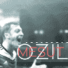
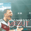
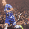
Requests Accepted Hariharan's GFX | Friendly battle Entry

What team siggy do u want

  • India

  • Barca

  • Real Madrid

  • Australia


Results are only viewable after voting.
Status
Not open for further replies.
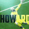
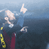
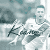
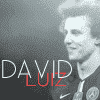
Lights are too bright once again. Bro please try to follow the Anish Lighting tutorial on the forum - your works have magnificently improved bnut your lights are spoiling 'em. Keep a noter that lights are to enhance your work and not to spoil it. Try to apply them through edges with a soft brush of 200-300px, try modes like screen, soft light, hard light, overlay, etc at different opacity to get the best of your work, a good tip would be try changing the PS BG color of PS to white rather than the default dark grey it will really help in lights. Talking about the text - Honestly speaking the text isn't good and not adding exact taste what it should. In the first one the text isn't even visible, Klopp one wasn't needing any. NEYMAR one at a lesser size and a bit of gradient overlay and a bolder weight could've looked much better. Pep one looks good but a tweaking in the blending options, the Pep text could've been given a stroke or could've looked much more better. You could try different colors and variations. Gomez one looks bad with text though. Keep it up though. And please try keeping these tipsd in mind it all what I've learned it in the two years of graphic designing.
 
Lights are too bright once again. Bro please try to follow the Anish Lighting tutorial on the forum - your works have magnificently improved bnut your lights are spoiling 'em. Keep a noter that lights are to enhance your work and not to spoil it. Try to apply them through edges with a soft brush of 200-300px, try modes like screen, soft light, hard light, overlay, etc at different opacity to get the best of your work, a good tip would be try changing the PS BG color of PS to white rather than the default dark grey it will really help in lights. Talking about the text - Honestly speaking the text isn't good and not adding exact taste what it should. In the first one the text isn't even visible, Klopp one wasn't needing any. NEYMAR one at a lesser size and a bit of gradient overlay and a bolder weight could've looked much better. Pep one looks good but a tweaking in the blending options, the Pep text could've been given a stroke or could've looked much more better. You could try different colors and variations. Gomez one looks bad with text though. Keep it up though. And please try keeping these tipsd in mind it all what I've learned it in the two years of graphic designing.
I am keeping in mind all of those lighting tuts. Plus, I have a new lighting brush now. I am trying lights softlight,screen normal at 60percent opacity and I am using light colours.I know JOE Gomez was bad. But what is wrong with KLOPP and NEYMAR !?I am using the white background as default. I am applying lights at the edges at 300 px or 250px and Anish's tut is not that effective for me IMO. I have tried different colours as in Pep Guardiola one. I agree with Neymar's text.

I think my monitor's brightness and contrast has something to do with my work. Comment the monitor brightness and contrast please and let me check if mine is normal.
 
Ligths using brush tool should be little less visible and focus should be on the main stock if you're not using textures. Text needs little more improvements as well. It's been a good set for you overall; you're rapidly improving.:)
 
Ligths using brush tool should be little less visible and focus should be on the main stock if you're not using textures. Text needs little more improvements as well. It's been a good set for you overall; you're rapidly improving.:)
Thanks. Noted all the points. Nothing more special than a positive feedback ! Happy Christmas
 
Finally, comeback in wallpapers. This time focussed on the lightings a lot , created and used a lot of textures . Phew !:thumbs
Geoffrey Kondogbia
Kondogbia.png
 
Looks good, the text is great and render effects look good but the BG Seems to be a bit empty. A 8/10 is not going anywhere for this. KIU :thumbs.
 
Everything looks fine, just lights are too bright once again.
 
Considering lights, placement and text in avatars, they're are brilliant. Again, lightning using brush should be less visible. Also use selective colors to highlight those which cover the render or are around the render. Mostly kit, grass, etc.

Wallpaper is a masterpiece. Loving it.
 
It looks great yet it's unfinished. Some effects over render and text are important. Background is fantastic though, and the placement of render is good too.
 
CR7 wally looks good. Use of text and bg textures was great. But the blue lighting over the render spoils the overall work little bit.

[HASHTAG]#HappyNewYear[/HASHTAG]
 
Status
Not open for further replies.

Users who are viewing this thread

Top