Shreevatsa
Club Cricketer
awesome stuff Pranav
Wow ! thats rocking .
Your work is speechless
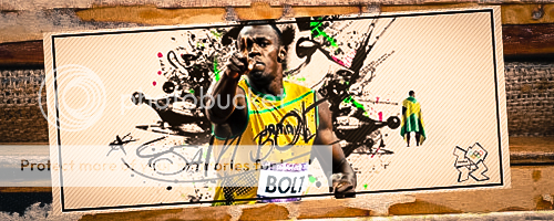
I really dint like your entry this time,Pranav.The Sig had too much contrast and the Lighting was poor And it was too much sharpened.Try to avoid that next time.")
awesome stuff Pranav
Not so great. Looks somewhat messed up. Must be the lack of practice.
Didn't like the ava, the stock is poorly placed and both ava & sig are a bit rusty, I think it's sharpened a tad high, a bit more effects would have made it look better. Love the innovation & placement of the text though. You'll do better if you do stuff regularly.
Something after a very long time!

Looks brilliant
You'll do better if you do stuff regularly.
What was the font used in the sig again?
Nah, I haven't. But let me take that as a request. I haven't done any in some time!Hey Pranav, have you made any Dale Steyn Wallie till now. I couldn't find any on the 1st post.
Nah, I haven't. But let me take that as a request. I haven't done any in some time!


There you go:
Dale Steyn Wallpaper -
Click!
Aren't you bored of Penelope Cruz?Much better. Love the innovation. Can I take this as a chance to request stuff of..umm...Penelope Cruz?
Much better. Love the innovation. Can I take this as a chance to request stuff of..umm...Penelope Cruz?