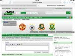
How does it look in dark blue?Orange colored buttons(on top) don't look nice though.
You are using an out of date browser. It may not display this or other websites correctly.
Meet
Chairman of Selectors
- Joined
- Feb 8, 2009
- Location
- Bhavnagar, Gujarat
Dark green would look great in place of it( probably of different shade used in pc theme).How does it look in dark blue?
- Joined
- Mar 30, 2011
- Profile Flag
- Canada
This cover does not seem to fit...
It centres and repeats the image you choose, but you can make one up to 2500 pixels wide - the frame is 175 pixels tall, so something at 1024x175 is probably the minimum recommended, or something smaller that you're happy to have tile horizontally.
The limit is 2500x250 because of people already using 250x250 images, but 175 pixels is all it shows vertically.
----------
NopeBtw does animated stuff work for the cover?
Siddhant007
International Coach
AbhishekS
Chairman of Selectors
- Joined
- Dec 10, 2008
- Location
- Mumbai, India
- Online Cricket Games Owned
- Don Bradman Cricket 14 - Steam PC
The idea of a cover picture is nice.
The recent developments on PlanetCricket have been pretty impressive. Great job, guys!
The recent developments on PlanetCricket have been pretty impressive. Great job, guys!

- Joined
- Mar 30, 2011
- Profile Flag
- Canada
SiriusBlack
ICC Chairman
How is it now?I'm not quite sure what those linked things are called on the cover photo area, but they don't seem to be aligned properly when viewing the profile on an iPad.
- Joined
- Sep 5, 2008
- Location
- England
- Profile Flag
- England
- Online Cricket Games Owned
- Don Bradman Cricket 14 - PS3
- Don Bradman Cricket 14 - Steam PC
- Don Bradman Cricket 14 - PS4
Is there any way to set 'PlanetCricket Green testing' as my default style?
Meet
Chairman of Selectors
- Joined
- Feb 8, 2009
- Location
- Bhavnagar, Gujarat
The theme you choose will be your default theme. If you're asking for mobile/tab, I am not aware about it.
Way down the bottom on this page you can set a default style for your account.Is there any way to set 'PlanetCricket Green testing' as my default style?
- Joined
- Jan 1, 2013
- Location
- Kingston, Jamaica
- Profile Flag
- West Indies
- Online Cricket Games Owned
- Don Bradman Cricket 14 - Steam PC
Is it just me or we all don't have a reply and view conversation buttons on the VM wall in the 'PlanetCricket Green Testing' theme?
Meet
Chairman of Selectors
- Joined
- Feb 8, 2009
- Location
- Bhavnagar, Gujarat
It is. Check bottom right of the message.Is it just me or we all don't have a reply and view conversation buttons on the VM wall in the 'PlanetCricket Green Testing' theme?

Similar threads
- Replies
- 22
- Views
- 3K
Users who are viewing this thread
Total: 3 (members: 0, guests: 3)


