Burma's Finest 1080p HD Resolution Bat Textures: Pre-Release Preview

Status
Not open for further replies.
Try inverting the wood colour as a start for your specular map. This should give it a more 'woody' look, rather than being plastic-y. Then I would simply use a grey colour for any stickers added, as these normally have a glossy finish to them.

So yea, try a blue hue for the wood specular.
 
Yeah, good idea.

Thing is, the shaders produce a very poor specular finish on flat surfaces in the game. It only looks any good where there are normal maps/height maps. Otherwise you end up with a nasty semi-opague white 'layer' over the top of the stickers which looks rubbish. I'm experimenting with a couple of techniques to try and get around this, all of which involve using coloured specular maps.
 
Re the stickers:

I would try a very desaturated, hue-inverted specular map. This is likely to make the highlights more subtle, but still remaining quite plain. I'll leave you to play and show us what you achieve, as we all know you know what you're doing!
 
Re the stickers:

I would try a very desaturated, hue-inverted specular map. This is likely to make the highlights more subtle, but still remaining quite plain. I'll leave you to play and show us what you achieve, as we all know you know what you're doing!
Well, I have a certain logic I'm working to but I'm more than happy to try anything that produces the desired results. :)

Here's the challenge as I see it...

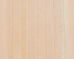
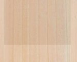
I've put 3 images below taken from my Adidas Pellara Elite texture files.

The 1st image is the base wood grain texture; the 2nd is the wood overlaid with a translucent base on which the colours are printed; the third image is all three layers as per the final result.

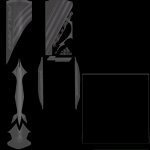
The 4th image is the Transmission specular map for the same bat.

Now, to my mind, taking the sticker to be made of a single material - the translucent layer - upon which paint/colour etc. is printed. There should only be two variations of tone in the resulting specular map. One for the translucent portions and one for the painted areas.

But, as you'll see from the Transmission specular map, they have gone with what is essentially a desaturated diffuse map as a specular layer. I don't agree with this as, for example, why would the yellow by more or less specularly reflective than the black given their materiality is the same?

Are you with me so far?
 

Attachments

  • Wood01.jpg
    Wood01.jpg
    10.8 KB · Views: 59
  • Wood02.jpg
    Wood02.jpg
    10.6 KB · Views: 54
  • Wood03.jpg
    Wood03.jpg
    22.2 KB · Views: 77
  • pellara specular.jpg
    pellara specular.jpg
    23.9 KB · Views: 77
That is not always the case. I would say that there would be three variations:
- the wood (includes grain variations)
- the translucent bit of the sticker (i.e. the blank bit but is still made of sticker)
- the actual coloured bit of the sticker.

I've just been looking at my bat, and there is definitely a difference between the specular highlights where the sticker has colour and where it does not. I think this is because the colours are printed onto the stickers, and the stickers are actually quite matt, but the printing ink is quite shiny.

I certainly don't believe there is as much difference in the specularity as CM have put in that example you show.

There may also be some 'extra-specular' bits on certain bats to consider. For example, Slazenger used to have a bat with chrome-like stickers, as did GM I think.

EDIT: just realised that I'm arguing on the same side here due to:

Burma's Finest said:
There should only be two variations of tone in the resulting specular map. One for the translucent portions and one for the painted areas.

But the bit about the chrome/whatever still stands!

Re-Edit:

Also, consider that the stickers may be more separated than just one block for front and back. Look at this:
pellara.JPG


You can see each bit has its own sticker, but also the translucent 5mm or so border around each sticker. Perhaps just use a stroke layer effect for this, with a very low opacity.
 
Last edited:
Adidas Pellare Bat is an easy one to make.

Hey BF, I have a PSD of it which I used to make for Cricket 07, you can use it as a reference.
 
I've just been looking at my bat, and there is definitely a difference between the specular highlights where the sticker has colour and where it does not. I think this is because the colours are printed onto the stickers, and the stickers are actually quite matt, but the printing ink is quite shiny.

I certainly don't believe there is as much difference in the specularity as CM have put in that example you show.
Ok Tom, check this out...

After a bit of playing around with my specular maps, here's what I've got so far. The image below is a plain bat diffuse map with the MRF Genius specular map I've created. Obviously I've left out the colour map for the stickers in order to demonstrate the specular difference. What do you reckon? Bear in mind that the lighting is dusk conditions hence the hues, tones, and shadows.

3865084780_de7593f82f_o.jpg
 
Great work mate you are going very well in this forum.:clapCan you give bat preview from back if possible.:)
 
I think that specular looks very nice indeed, and looks about right when I hold up my bat to the sum coming in through my study window!
 
Much like the others in this thread, all I can say, is great work and that hopefully one day I can see your bats in my game.
 
So here's the final result after all that...

(apologies for the motion blur)

3864897909_e176e61733_o.jpg

The Bat looks Spectacular with the edited specular map.....
any advice on how to make the proper specular maps for kits would be very much appreciated
 
Status
Not open for further replies.

Users who are viewing this thread

Top