You are using an out of date browser. It may not display this or other websites correctly.
Chaits Graphics: More avatars.:)
- Thread starter Ohm
- Start date
G
gitm
Guest
Now they looks cool

G
gitm
Guest
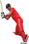
Give me the render, then I'll comment


Good work!


Good work!

- Joined
- Aug 29, 2012
Give me the render, then I'll comment "" "
" "
" "
"
Good work!
Too many useless smiley icons. Are you trolling me?
G
gitm
Guest
Too many useless smiley icons. Are you trolling me?
No. Just the render please.
G
gitm
Guest
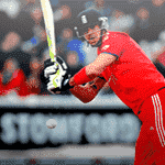
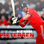
Helmet was the drawback. Not good as the AB render though. Still awesome for a guy who has just started render making.

Sulaiman7
ICC Chairman
Helmet was the drawback. Not good as the AB render though. Still awesome for a guy who has just started render making.
This. KIU.


Sulaiman7
ICC Chairman
The Lewandowski siggy was a good one with good innovation but the part on the right side doesn't looks good or simply we can say that you could have applied the spot healing brush tool so it would look nicer.The Januzaj one is also good (probably better than the Lewandowski one) as the innovation is brilliant and is marvelously execute. The big flaw is the render , it isn't properly blended nor resized and the text Januzaj is covering the render from the bottom (the focal render). It could have been looking better and nicer with only one medium sized render , the small render which became your focal point unfortunately which shouldn't be. The BG and the outer glow of the render of ABD is looking bad tbh it ruins all the hard work , two renders would have been enough , the text also doesn't fit properly but the good and improving this is the placement , it was awesome and the renders were brilliantly blended. Hope you get the suggestions right. Good try on the render , zoom in fully to get a clean , nice & proper cut. The helmet is clearly a drawback as Neer bro said above. 
KIU.

KIU.

Similar threads
- Replies
- 12
- Views
- 2K
- Replies
- 20
- Views
- 3K
Users who are viewing this thread
Total: 1 (members: 0, guests: 1)

