Chaits Graphics: More avatars.:)

Do you like my work?


  • Total voters
    23
texture is misplaced
effects don't look good on the first one
try harder ..
Not your best...
kiu
Neer said everything KIU.
I echo NEER!

Well I won't say I've not worked badly over those two. I got back to Ps after a month and didn't really recall how things should be performed in Ps, so ended up with two of my worse artworks. Thank you anyway for saying the real thing.:)
 
Not been in graphics since a long time; lost path. This should be the time to get over it. Tried the hands over some lightning. Comment please.:) [HASHTAG]#Back[/HASHTAG]

pup.png pupclr.png

This one I made a few days back on a request but didn't post.

Mccullum.png
 
Looks nice!
in mccullum, you've darkened the sides way too thickly! use a big brush while doing this...
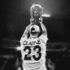
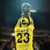
Clarke avvy needed a few cool tunings!!
 
  • Like
Reactions: Ohm
The Baz one is slick...Good one.I like the fontwork..that looks neat and good.

The Clarke one,the b/w requires a lil sharpening of clarke's image..The coloured one can use a light of a different colour..Actually,try mixing few shades of colour..you can make it amazingly..

You seem to be a little rusty,youll gain that in no time :D
 
  • Like
Reactions: Ohm
You're always awsome!:)
 
Boom! Thought, it's a good time to make some graphics. Life is going great and I have got plenty of time to do these things for a while.:)

hazlewood.png hazlewoodbw.png mahrez.png
 
Last edited:
So, you have recovered from your HDD crash. Avas are nice. Although, Mahrez text looks bad.
 
  • Like
Reactions: Ohm
Lovely , Mahrez text looks fab. Punter looks good too.
GREAT to see ya back!
 
  • Like
Reactions: Ohm
So, you have recovered from your HDD crash. Avas are nice. Although, Mahrez text looks bad.

Mahrez one is better off without the text. Slick lightings!
Love the B and W version of the first one

I thought the plain text would look bad, also the text with every-other effect I tried, and no text was just worse than everything. I myself really liked to put the bold text. Without lights it was looking much simple, dull you can say. Anyway, I shall still keep this in mind and try not to use such lights behind the text. Since the focus of graphics that I do is not just limited to me, I'd really appreciate people speaking freely about my stuffs.:)

Lovely , Mahrez text looks fab. Punter looks good too.
GREAT to see ya back!
He is.....

.

.

JOOooSh Hazlewood.:p
Spoiler for this did not work @admin

By the way, thanks.
 
Last edited:

Users who are viewing this thread

Top