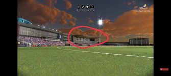
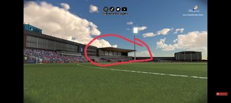
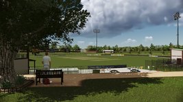
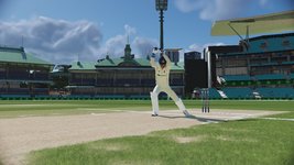
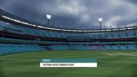
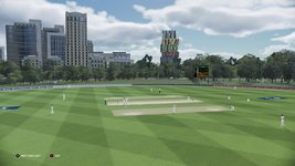
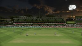
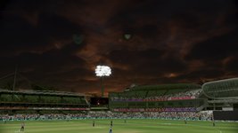
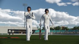
There are few things that are worrying me..in the screenshots of stadiums released by BA yesterday of the upcoming AFL title, the stands don't look good at all...the blurring effect proportionate to distance is completely missing...there is unusual sharpness in the objects.the lighting and shadow over the stands seem completely out of the place..there might me missing textures.etc overall the stands are not looking realistic at all...i hope Devs fix this in cricket 24..here are pics for reference
You are using an out of date browser. It may not display this or other websites correctly.
Cricket 24 - General Discussion
- Thread starter asprin
- Start date
D
Deleted member 185125
Guest
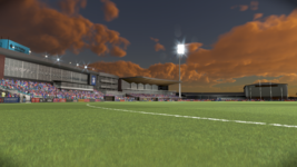
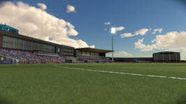
Thanks. Can you slide in some screenshots from Cricket 24 as well? Asking for a community.These are available in better quality than what was posted rather than screencaps from Bood. As mentioned in that release these were taken from the tools that we use internally, which were to showcase the new stands added, these have many of the in-game effects turned off to get a clear view.
View attachment 278473
View attachment 278474
These are available in better quality than what was posted rather than screencaps from Bood. As mentioned in that release these were taken from the tools that we use internally, which were to showcase the new stands added, these have many of the in-game effects turned off to get a clear view.
View attachment 278473
View attachment 278474
Nice...then that would solve the shadow, the absent blurring effect and lighting issue we see in the above screencaps.. however according to me colour saturation of the crowd still seem to be little saturated...this needs to be toned down a little...the turf on the other hand is looking very realistic but the saturation of colours in the crowd seems to break that immersion...These are available in better quality than what was posted rather than screencaps from Bood. As mentioned in that release these were taken from the tools that we use internally, which were to showcase the new stands added, these have many of the in-game effects turned off to get a clear view.
View attachment 278473
View attachment 278474
Ashy-90
Associate Captain
- Joined
- Apr 13, 2012
- Location
- Karnataka,INDIA
- Profile Flag
- India
- Online Cricket Games Owned
- Don Bradman Cricket 14 - PS3
- Don Bradman Cricket 14 - Steam PC
AFL trailer looks same with no changes .. Still the same commic crowd ppl , No realistic things  Hope C24 will not make big changes as previous c22 version ..
Also , the commentary video shows still the same old scripts are used for c24 , no emotions and robostic things are continued ..
 Hope C24 will not make big changes as previous c22 version ..
 Also , the commentary video shows still the same old scripts are used for c24 , no emotions and robostic things are continued ..
gkvarma18
International Cricketer
- Joined
- Jun 29, 2016
- Location
- Hyderabad , India
- Profile Flag
- India
- Online Cricket Games Owned
- Don Bradman Cricket 14 - Steam PC
AFL23 trailer is better. Player models and animations are far better than previous games definitely
freeshead55
Club Cricketer
- Joined
- Aug 10, 2009
- Online Cricket Games Owned
Seeing those screenshots and AFL trailer, graphics looks absolutely flat.
Being a 3D Animation artist i can say that
-they have worked on the major details but made them look flat.
-Cloud texture is stretched and thus it looks blurry and messed up. Cloud should look crisp clear
- In that night/sunset screenshot, each and every corner of the stadium looks brighter. No dark side or no natural twilight reddish or oranges light effect on the stadium/crowd
- in the AFL trailer, Animation looks great, mechanism looks great but still character looks flat.
Hope they add depth to graphics, as of now like previous cricket 22 there's too much tint and less saturation.
I hope they give these few options in setting to change, brightness, contrast, saturation and black
MARK99ZA
County Cricketer
- Joined
- Dec 22, 2016
- Location
- Cape Town, South Africa
- Profile Flag
- South Africa
- Online Cricket Games Owned
- Don Bradman Cricket 14 - PS3
- Don Bradman Cricket 14 - PS4
Yeah the clouds look like what I would see if I wasn't wearing my spectacles and a storm were approachingSeeing those screenshots and AFL trailer, graphics looks absolutely flat.
Being a 3D Animation artist i can say that
-they have worked on the major details but made them look flat.
-Cloud texture is stretched and thus it looks blurry and messed up. Cloud should look crisp clear
- In that night/sunset screenshot, each and every corner of the stadium looks brighter. No dark side or no natural twilight reddish or oranges light effect on the stadium/crowd
- in the AFL trailer, Animation looks great, mechanism looks great but still character looks flat.
Hope they add depth to graphics, as of now like previous cricket 22 there's too much tint and less saturation.
I hope they give these few options in setting to change, brightness, contrast, saturation and black
Muhammad shafiq
Associate Cricketer
- Joined
- Jun 28, 2017
- Location
- Pakistan
- Profile Flag
- Pakistan
- Online Cricket Games Owned
- Don Bradman Cricket 14 - Steam PC
Here is AFL23 trailer pro team things .. Cricket24 should be beter thn this cuz the ghraphics are same as cricket22 .
MARK99ZA
County Cricketer
- Joined
- Dec 22, 2016
- Location
- Cape Town, South Africa
- Profile Flag
- South Africa
- Online Cricket Games Owned
- Don Bradman Cricket 14 - PS3
- Don Bradman Cricket 14 - PS4
I can live with the fluffy clouds it they actually have any impact on gameplay, cast shadows, etc. Otherwise, what is the point? And please can we have the ability to actually choose the weather this time? The whole summer, autumm, spring options were badly implemented
gkvarma18
International Cricketer
- Joined
- Jun 29, 2016
- Location
- Hyderabad , India
- Profile Flag
- India
- Online Cricket Games Owned
- Don Bradman Cricket 14 - Steam PC
At the time of release of Cricket 22, we were able to choose what type of weather in-game from menu. But patching removed that later.I can live with the fluffy clouds it they actually have any impact on gameplay, cast shadows, etc. Otherwise, what is the point? And please can we have the ability to actually choose the weather this time? The whole summer, autumm, spring options were badly implemented
Cricket 24 won't be complete unless I can select 'Hail' for weather.
karolkarol
International Cricketer
I can live with the fluffy clouds it they actually have any impact on gameplay, cast shadows, etc. Otherwise, what is the point? And please can we have the ability to actually choose the weather this time? The whole summer, autumm, spring options were badly implemented
Bang on, there are so many fundamentals to get right like the effects of weather, edges, bowling changes, fielding, AI pacing etc. I'm hopeful BA have taken feedback on board and prioritise these, which are all pretty integral to the game of cricket and gaming immersion, over any of the Ultimate Team style flashy nonsense.
- Joined
- Jul 30, 2014
- Location
- Melbourne
- Profile Flag
- Australia
- Online Cricket Games Owned
- Don Bradman Cricket 14 - Steam PC
Similar threads
- Replies
- 11K
- Views
- 2M
Users who are viewing this thread
Total: 19 (members: 0, guests: 19)

