You are using an out of date browser. It may not display this or other websites correctly.
Don Bradman Cricket 17 - Cover Revealed!
- Thread starter MattW
- Start date

Fissionmailed
Associate Captain
- Joined
- Aug 9, 2013
- Location
- Western Sydney
- Online Cricket Games Owned
- Don Bradman Cricket 14 - Xbox 360

placing bets on gameplay? Trailer? teaser trailer?
No i got it, date for the trailer announcement, yeah that's it

UnknownSoul
Associate Cricketer
- Joined
- Sep 2, 2012
- Location
- Norwich, UK
- Online Cricket Games Owned
- Don Bradman Cricket 14 - Xbox 360
- Don Bradman Cricket 14 - Steam PC
- Don Bradman Cricket 14 - Xbox One
nice cover ") Things are starting to warm up very nicely
Things are starting to warm up very nicely
Things are starting to warm up very nicely issue
Associate Captain
- Joined
- May 15, 2013
- Location
- Banglore India
- Online Cricket Games Owned
- Don Bradman Cricket 14 - PS3
- Don Bradman Cricket 14 - Steam PC
- Don Bradman Cricket 14 - PS4
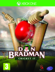
Red ball.... Floodlights on....
DAY NIGHT TESTS CONFIRMED
(Love it btw)
Day night test match was there in DBC 14[DOUBLEPOST=1476690315][/DOUBLEPOST]In cover all is good, except the Don bradman text ..... it looks like armature font
LittleBigPlanet
Club Captain
- Joined
- Mar 14, 2016
- Profile Flag
- Australia
- Online Cricket Games Owned
- Don Bradman Cricket 14 - Xbox 360
- Don Bradman Cricket 14 - PS4
Very cool! lush green grass tops confirmed also by the looks of that.... And thunderstorms!
blockerdave
ICC Chairman


i'm gonna say i preferred the classical approach of the 14 cover. i think this looks a little arcadey.
BRAB
International Coach
i'm gonna say i preferred the classical approach of the 14 cover. i think this looks a little arcadey.
Agreed. All this cover makes me want to do is dilscoop Kenya in a t20 match on amatuer difficulty.
LittleBigPlanet
Club Captain
- Joined
- Mar 14, 2016
- Profile Flag
- Australia
- Online Cricket Games Owned
- Don Bradman Cricket 14 - Xbox 360
- Don Bradman Cricket 14 - PS4
I like it, I really do! It looks fun and looks like it would take your eye - especially in the new release section amongst other new games, I think you need a few bright colours just for the spiff of it. Also I like the text, something about it reminds of top spin 4 menu designs, and that's a good thing because that game presented well - clear, precise and simple to use! Pretty excited personally seems to be all on track for a quick release.. Touch wood

i'm gonna say i preferred the classical approach of the 14 cover. i think this looks a little arcadey.
A more like "Ashes Cricket 2009 "
 .........
aabretz
Banned
- Joined
- Dec 13, 2013
- Location
- Panorama City, California USA
- Profile Flag
- Australia
- Online Cricket Games Owned
- Don Bradman Cricket 14 - Xbox 360
- Don Bradman Cricket 14 - Steam PC
- Don Bradman Cricket 14 - Xbox One
SibiNaayagam
International Coach
- Joined
- Oct 7, 2012
- Location
- Los Angeles, CA, USA
- Online Cricket Games Owned
- Don Bradman Cricket 14 - Steam PC
Love the detailing in the design. It's simply amazing. Probably not a fan of the font for the title but it's still good. So love it overall. And for those who say it looks arcade like, it's fine, it has got a lot more energy now and casual fans would want to pick it up.
blockerdave
ICC Chairman
Agreed. All this cover makes me want to do is dilscoop Kenya in a t20 match on amatuer difficulty.
I wouldn't go quite that far, though admittedly I almost made a joke (almost certainly a bad one) about where should i deposit my quarters... it really does look like something you might see below a big yellow joystick and 2 red buttons.
I suspect that as with the change of type face, the BA art dept aren't entirely responsible... And the best compliment I can pay it is the cover is entirely in keeping with the typeface.
Hell, if it draws more sales then I am all for it. I bet @Chief loves it...
I would say the game and the academy will have to offer more intuitive and simpler "arcadey" formats than 14 did if it is not to disappoint those drawn in by the cover. if it does that while still offering more substantial fare to the likes of us here then they are on to a winner. I hope so.[DOUBLEPOST=1476695801][/DOUBLEPOST]
Red ball.... Floodlights on....
DAY NIGHT TESTS CONFIRMED
(Love it btw)
you can play day night tests in 14, because academy.
I wouldn't go quite that far, though admittedly I almost made a joke (almost certainly a bad one) about where should i deposit my quarters... it really does look like something you might see below a big yellow joystick and 2 red buttons.
I suspect that as with the change of type face, the BA art dept aren't entirely responsible... And the best compliment I can pay it is the cover is entirely in keeping with the typeface.
Hell, if it draws more sales then I am all for it. I bet @Chief loves it...
I love the ball/wickets. But I hate the logo, and find the lightning/storm thing a very odd choice.
But I don't think it will put anyone off - it certainly makes it look a bit more exciting, and it's very clear what it is.
Similar threads
- Replies
- 1
- Views
- 1K
- Replies
- 161
- Views
- 29K
- Replies
- 158
- Views
- 31K
Users who are viewing this thread
Total: 2 (members: 0, guests: 2)