You are using an out of date browser. It may not display this or other websites correctly.
Ten Sports TV overlay
- Thread starter Prakash
- Start date
hassan
International Coach
ok take ur time
ndn_enigma
Club Cricketer
- Joined
- Jul 22, 2005
- Online Cricket Games Owned
Prakash, can you please finish this overlay, I love it, just want a nice scoreboard panel to go with it, also I want you to change the EA logo that comes by from the right side of the screen right before it goes to the batting screen to the Ten Sports logo (like das did in his ESPN overlay), that would be great, other than that this is still my favorite overlay, the sleekest one of all.
ndn_enigma
Club Cricketer
- Joined
- Jul 22, 2005
- Online Cricket Games Owned
Any updates on this one Prakash, or are you working on the Player Editor ") .. if you are then is it gonna be possible to make before the end of the year, I think colin gave up on it, lol.
.. if you are then is it gonna be possible to make before the end of the year, I think colin gave up on it, lol.
.. if you are then is it gonna be possible to make before the end of the year, I think colin gave up on it, lol.Currently I am not working on with any TV graphics, as you know I have been trying to edit the mch file to create classic matches in c2005!.
I gave up the player editor way before colin , as it will be consuming so much time and it won't be straight forward like BLIC
  .
.
I gave up the player editor way before colin
, as it will be consuming so much time and it won't be straight forward like BLIC .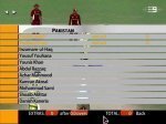
ndn_enigma
Club Cricketer
- Joined
- Jul 22, 2005
- Online Cricket Games Owned
WOW aussie, it looks great, you'll probably need to make the red under the 0.0 overs larger since we could have 49.4 overs and that's most likely going to go out of the red. But great start, if you feel like making the bottom bar with the score thinner since it's most likely going to overlap with the bowling meter and the little map on the bottom right hand corner, feel free to do so.
Unless you can move those up a bit. But it would still probably look neater if the bar was thinner, I'll let you decide") .
.
Unless you can move those up a bit. But it would still probably look neater if the bar was thinner, I'll let you decide
.akira2291
Club Cricketer
...and the "pakistan" should be a little bigger. looking forward to it.
ndn_enigma
Club Cricketer
- Joined
- Jul 22, 2005
- Online Cricket Games Owned
Some please help us find screenshots for the graphs such as the worm/spider/wagon wheel, it would be a great help... thanks.
I can't make Pakistan bigger unless you want it as non capitals.
The players name are font 6, but i'll probably make it font 1 unless you guys think it should be something else.
The Extra and stuff are the right size (font 6) but I may try Font 5 to get it bolder.
Don't worry about the position this was a testing screenshot seeing where the red boarder was.
The types of font below.

I haven't started with the scoreboard yet but i'll keep it the size you see in the screenshot cause thats how big it is in real life. I'll have no problem moving the bowling metre.
The players name are font 6, but i'll probably make it font 1 unless you guys think it should be something else.
The Extra and stuff are the right size (font 6) but I may try Font 5 to get it bolder.
Don't worry about the position this was a testing screenshot seeing where the red boarder was.
The types of font below.
ndn_enigma said:WOW aussie, it looks great, you'll probably need to make the red under the 0.0 overs larger since we could have 49.4 overs and that's most likely going to go out of the red. But great start, if you feel like making the bottom bar with the score thinner since it's most likely going to overlap with the bowling meter and the little map on the bottom right hand corner, feel free to do so.
Unless you can move those up a bit. But it would still probably look neater if the bar was thinner, I'll let you decide
I haven't started with the scoreboard yet but i'll keep it the size you see in the screenshot cause thats how big it is in real life. I'll have no problem moving the bowling metre.
akira2291
Club Cricketer
allright, understand. then its okay so.
Cricketman
ICC Chairman
- Joined
- Jul 27, 2005
- Location
- USA
great job.
Similar threads
Users who are viewing this thread
Total: 1 (members: 0, guests: 1)