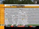
Ten Sports TV overlay

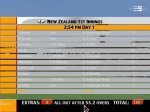
I just noticed that when a team is all out the Overs thing gets much bigger. Due to this would you guys want the red box expanded to cover the "All out after 90 overs" or just take out the red box from the overs (Extras and Total will still have red boxes)

Ignore the Total bit that was just me trying to position it properly due to the overlapping of the Overs
 

Attachments

  • tensports.jpg
    tensports.jpg
    75.1 KB · Views: 155
I think it's better to just take it out personally.

And this screenshot makes it look 10000000 times better than the fuzzy one, lol
 
Last edited:
:laugh So true. I resized it so it was still small for those 56k users (not that I usually think about them :D)

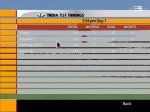
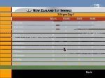
Another problem I found was as shown in the screenshot any player that is out appears as white font which I have no why it happens as there is nothing in the XML file showing this.
 
That's true.. but it doesn't look that bad either way.. it might look nicer in black though... try your best, if not, it's still good :)
 
It definitely looks nicer in black and way more accurate, but once again EA has hidden another thing to edit thus preventing me from changing the colour.
 
Here is the latest. Hopefully someone can get screenshots of the graphs, spider and wagon wheel.
 

Attachments

  • Cricket2005 2005-09-17 18-12-09-10.jpg
    Cricket2005 2005-09-17 18-12-09-10.jpg
    42.8 KB · Views: 129
  • Cricket2005 2005-09-17 18-12-00-75.jpg
    Cricket2005 2005-09-17 18-12-00-75.jpg
    45.3 KB · Views: 126
  • Cricket2005 2005-09-17 18-11-26-93.jpg
    Cricket2005 2005-09-17 18-11-26-93.jpg
    49.3 KB · Views: 123
Sorry Aussie, I tried to get you graphs but I downloaded a cricket match that was on Ten Sports but it happened to be only highlights, but I was surprised that not even once they showed any graph, or else I would've posted them up for you... anyone in India, Pakistan, or UAE would probably be able to get a hold of these graphics... please guys, help us out here.
 
Ndn are the in game graphics the same as the one Prakash made? I will be changing the scoreboard size so it flows with my graphics but are the popups right?
 
It seems ok, I'm just not sure if there's that ten sports live graphic in the corner since what I downloaded was just the highlights, but I liked the look of that in the corner, not the small one that Prakash made at first but he changed it to the bigger graphic because of a request by someone else... the small one was too small IMO
 
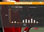
Ok, I have got some time off so hopefully I can finish the ten sports patch. I have done the graphs just have to do the spider, wagon wheel and the menu stuff.
All the graphs will look like the attached image.
 

Attachments

  • manhat.jpg
    manhat.jpg
    78.6 KB · Views: 84
Can u also do the menu page which displays the scorecard, statistics etc., because all the other overlays don't have that. It will look better if you could do that as well.
 
Currently that isn't possible. Basically what ever the other overlays had will be what this one has.

Release date sometime this week I hope.
 
Can you have the player's names in black instead of white, it will provide a better contrast. Is that what everyone else is saying? You did this in the previous page why can't you do it now?
 

Users who are viewing this thread

Top