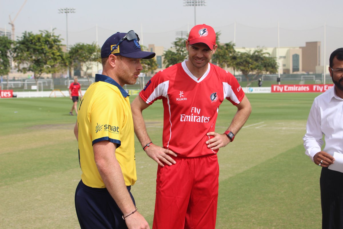
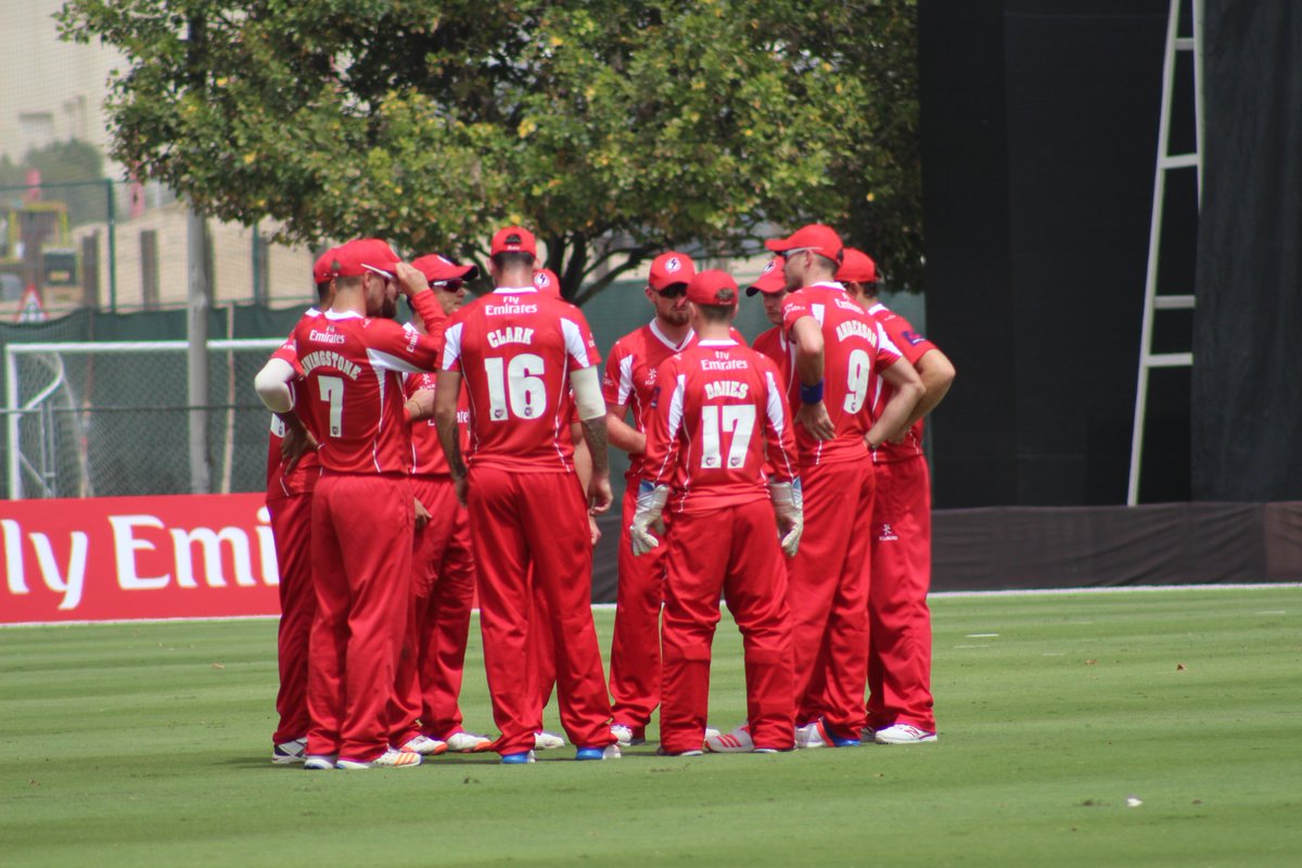
The 2017 County Project

My understanding from the Notts official post is that the silhouette is the same but I could be wrong. One thing to note is that the collars on the two limited overs shirts are different. The t20 has the v-neck as seen in my above picture while the RLC has a traditional collar

& @Kiko_97

Yep the only difference I can see is the collar. Don't worry I have some additions to the design to make it work for the T20 blast too. Just making some tweaks to the overall detail of the silhouette to make it more authentic. Original file was only 7KB so plenty of room for improvement. Probably will have them shared by the weekend, but no pressure.

@dom2110 you didn't happen to see the trousers by any chance? Is it a pinstripe? Plain green?
 
Last edited:
& @Kiko_97

Yep the only difference I can see is the collar. Don't worry I have some additions to the design to make it work for the T20 blast too. Just making some tweaks to the overall detail of the silhouette to make it more authentic. Probably will have them shared by the weekend, but no pressure.

@dom2110 you didn't happen to see the trousers by any chance? Is it a pinstripe? Plain green?
Think they are just plain green. This is the best picture of them at the moment
 

Attachments

  • IMG_0425.PNG
    IMG_0425.PNG
    110.3 KB · Views: 167
Think they are just plain green. This is the best picture of them at the moment

Cheers. Can't really tell from that. Nor where a Masuri logo would be. I would guess and put it on the left leg but dunno.

Also I'm a bit confused by the Royal London logo. On the stock images it's on the right sleeve, but on your photo it seems to be on the left. Any thoughts as to what might be more authentic?
 
Last edited:
Cheers. Can't really tell from that. Nor where a Masuri logo would be. I would guess and put it on the left leg but dunno.

Also I'm a bit confused by the Royal London logo. On the stock images it's on the right sleeve, but on your photo it seems to be on the left. Any thoughts as to what might be more authentic?
Think that's probably best for the trousers.

As for the logo think it can be either. Might just be the player's preference or how the manufacturer does it. Whole squad photos from last season seem to suggest this
 
Which teams still need kits for the following season as teams are beginning to show their new kits on their website shops. Is the OP up-to-date or not?
 
Ok latest draft before detail optimisation.

nottsfront.png
nottsback.png
 
Also just to show, that my silhouette has plenty of room for tweaks. I designed it wider than needed.

nottsdraft.png
 
IMG_0426.PNG
IMG_0427.PNG
RLC and t20 Blast for Kent. Sorry about the quality
 
I think @Llewelynf should do the spitfires Royal London shirt as he made a better spitfires logo than I did, plus he'll have the files available to do the neon outline. The T20 shirt looks a challenge!
 
Last edited:
the royal london logo goes on the arm that faces the camera when the player bats, as is the case with most arm sponsors. this is why it 'moves'
 
the royal london logo goes on the arm that faces the camera when the player bats, as is the case with most arm sponsors. this is why it 'moves'

Well damn, you learn something every day! Never occurred to me but it's so obvious now that I know!
 
I think @Llewelynf should do the spitfires Royal London shirt as he made a better spitfires logo than I did, plus he'll have the files available to do the neon outline. The T20 shirt looks a challenge!
I am hoping to get on that ASAP.
 

Users who are viewing this thread

Top