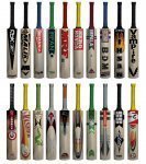
Most of the bats look abit blurry, which is either caused by the images obtained for the designs of the bat, or the quality of the programme you used to make the screenshot. As for the Globe, it stands out like a sore thumb. The texture on the back of the bat doesn't suit the bat, the Worm is too high up the bat, the top of the bat is abit square, and also the front sticker is too small and just looks completely out of proportion.
I understand that they're not final designs, but I think making bats needs the person to be abit of a perfectionist. I know from my own experience of making bats that I'd take multiple attempts to get a bat looking as realistic as possible, making sure the colours are correct, the stickers in proportion and in the right place, and then testing in game to make sure it looks perfect, if it didn't I'd make sure it was before I released it on here. I know that Burma's Finest worked in the same way when he was making his range of bats for Cricket 2007.
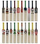
The bats made don't need much tweaking, but a few are a little out of proportion when it comes to the stickers. The bat shape could also do with abit of tweaking also, the shoulder of the bat is far too square and for certain bats, such as the Woodworm Globe and the GN Predator it looks abit strange. It's not anything major to worry about, just a few tweaks that need to be made.

")
 . Great work Guys :hpraise
 : i saw your so called contructive critism. You should know a thing Gesture far more important than your CC