TAOC Discussion

No worries, we are in awe of you fine work

Good luck with this and looking forward to when it it is finished

It look amazing so far
 
manee said:
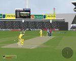
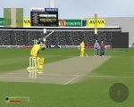
I think I have asked this before but can I please have a picture of Ricky Ponting, playing a square drive from a third man view to be used as the third part in this comparison screen.

hehe, ill try and get you one...lol...but my screen will not look as good as those, Manee...i openly admit TAOC's graphics will not be up to the big 2's standard. It's always been about the gameplay, though i hope to get my graphics as good as i possibly can.

cheers,

LM

manee said:
I think I have asked this before but can I please have a picture of Ricky Ponting, playing a square drive from a third man view to be used as the third part in this comparison screen.

here you go...hehe...nowhere near the others' quality...lol...but cute anyway... ;)
 

Attachments

  • TCP 2006-11-17 13-46-54-81.jpg
    TCP 2006-11-17 13-46-54-81.jpg
    131.4 KB · Views: 120
  • TCP 2006-11-17 13-48-10-62.jpg
    TCP 2006-11-17 13-48-10-62.jpg
    133.6 KB · Views: 120
  • TCP 2006-11-17 13-50-03-34.jpg
    TCP 2006-11-17 13-50-03-34.jpg
    141.3 KB · Views: 121
Very nice screens. The graphics look nice though gameplay is defiently more important.
 
ok..i did the comparison and AOC looks quite good tbh... :)

CREDITS TO MANEE FOR THE EA & BLIC COMPARISON !

what do you guys think ?
 

Attachments

  • Comparison 1 copy.jpg
    Comparison 1 copy.jpg
    88.1 KB · Views: 113
I actually prefer TAOC out of those three, it isn't edgy and have so many effects on it. Just looks real.
 
BLIC has nice shading but its too bright and blur !! besides,
its rendered..i doubt one will get such graphics on PC.
i am expecting the actual (in-game) graphics of BLIC to be slightly better
than the PS2 version.
 
is it rendered? that's puts a differ lead to the story.

brightness is on a little bit higher side, that's because they seem the be new to shaders... it isn't about brightness, there is excessive intensity. maybe corrected in final version.

blur because of low res pics. (i think)
 
blackleopard92 said:
is it rendered? that's puts a differ lead to the story.

brightness is on a little bit higher side, that's because they seem the be new to shaders... it isn't about brightness, there is excessive intensity. maybe corrected in final version.

blur because of low res pics. (i think)

it is either rendered or it is for the XBOX360. creating such graphics
for PC is almost impossible and especially from a company like codemasters

nope...blur is not because of low res pics...they added the "motion blur"
option in photoshop ;)

this is a PS2 Version Screenshot...i am expecting PC version to be SLIGHTLY
better.
 

Attachments

  • lara_pulltoleg_gc_ps2.jpg
    lara_pulltoleg_gc_ps2.jpg
    108.1 KB · Views: 100
It is too bright in BLIC because they do not have good enough lighting effects (I do not know what that is, but that is their reason).

That ponting shot is not rendered according to the codemasters community liason.

TAOC does not match up graphically as codemasters and EA have much better resources. But TAOC's graphics are OK, but what is going to be important is the gamplay which will be amazing.

PS: What is a render?
 
If you do it BLIC, EA, TAOC, you get a nice fluid stroke picture. From step one, two, three :) Wind up, playing, and finishing off :)
 
what is render, search wiki for it. too big to tell.
basically, it is creating a scene which is in adherance to the rules of physics.i.e. lightning, etc
renders can be done i real time, but xtreme power is required( which is what games are trying to achieve),
passive rendering creates immersive, real scenes, but u generally take a coffee:p break while waiting for it to happen. (like rendering option in 3DMAX)

and jk, these graphics are no big deal, cricket is a game which can be low on resources, hence can have powerful graphics be achieved.

and the brightness of pic posted above is excellent.
 
great comparison between games, its interesting because the taoc shot looks far more realistic than the other 2. Top work!
 
The cover drive looks v.good. Personally i prefer the blic one but still the taoc is quality. cricket 07 one just looks out of sync.
 

Users who are viewing this thread

Top