Don Bradman Cricket 17 World Premiere Discussion

Also one thing i would like to see in crowd if its not too late to ask for features is some placards in the crowd just that would make the crowd feel alive.


Even some thing crude as these just flags as placards added atmosphere in c07.

View attachment 174910
anycap6-jpg.44682


Now if we can have a few things placard in crowd with a few slogans, 4,6, flags etc will make it look great atleast for intl matches!
Lol IIRC I made some of those flags in C07. Cringing now. :lol
 
Can the stumps be adjusted so that they are less likely to cartwheel off? even the spinners appear to rip them out of the ground. This takes away the novelty of knocking over the stumps when it happens every time.
 
Can the stumps be adjusted so that they are less likely to cartwheel off? even the spinners appear to rip them out of the ground. This takes away the novelty of knocking over the stumps when it happens every time.

Haha this is the opposite of when DBC14 was released and they would barely move!
 
Actually about the flags...If I'm not wrong, RRL3's crowd had a decent amount of flags waving among them. Not sure if it making it to DBC17 or not?

EDIT: Went and looked at one of their vids. Yeah flags, camera flashes are all there. Also noticed how amazing the grass looks...can't wait for DBC17 :D Plus the color tone too seems perfect.

You mean the grass in this video trailer or in DBC 17? From the gameplay videos of DBC I've seen so far, the grass looks like it's from 2005. Ok, sorry for complaining about graphics. I see many people here asking to stop complaining about graphics as this game wasn't meant to be graphically superior.
 
You mean the grass in this video trailer or in DBC 17? From the gameplay videos of DBC I've seen so far, the grass looks like it's from 2005. Ok, sorry for complaining about graphics. I see many people here asking to stop complaining about graphics as this game wasn't meant to be graphically superior.
You're welcome to complain about graphics - but "looks like it's from 2005" is just meaningless hyperbole.
 
You're welcome to complain about graphics - but "looks like it's from 2005" is just meaningless hyperbole.
@MattW please consider adding highlights to the game.
It feels so satisfing to watch them after a long game of cricket.
 
People must realise that pretty much all they've seen are highly compressed non-HD youtube videos. From this point of view Rugby League 3 looks better but it's not really a fair comparison as that is a professional trailer in HD.

I'd say an image like this, which does genuinely look good, is a better indication

CqrqqqUVYAA3szW.jpg


The one thing I can safely say I worry about is the hair of the players, as I have seen them all in the academy in what I presume is the highest quality possible. If we look at this Chris Woakes, we all admit that as a face it's wonderful, but the hair just doesn't seem right. It's a bit hard to put a finger on it, but it's somehow grainy? It looks like there are horizontal lines going across it, particularly visible on the sides of the face. The colours also don't seem right, with a red hue in hair that should really be brown or blonde. It's as if they want us all to be rangas ;-)

woakes-png.174808


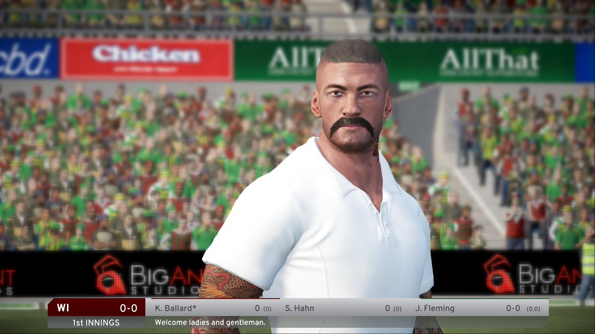
As for the player models it seems that Big Ant has taken on board the criticism of the previous game where all players were very muscular.
 
You mean the grass in this video trailer or in DBC 17? From the gameplay videos of DBC I've seen so far, the grass looks like it's from 2005. Ok, sorry for complaining about graphics. I see many people here asking to stop complaining about graphics as this game wasn't meant to be graphically superior.

I meant the grass in RRL3 is amazing and expecting to see that in DBC17, although the grass is cut short in cricket to have a faster outfield but as seen in one of the pictures Dutch had posted, the grass is 3D. All it needs is some more depth in adding color and adding contrast like in that RRL3 trailer.
 

Users who are viewing this thread

Top