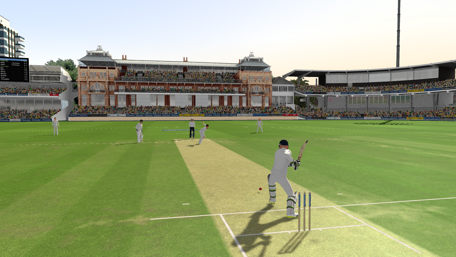
First Screenshots Released

The ball is to red chief, a test cricket ball is a dark red or is it easier to see in a game. p.s Would love to see screens from 3rd person behind batsman mode soon. Just 3 weeks and a new cricket game so excited right now.:cheers

The kookaburra ball is a lighter red than the Duke ball! Possibly the Kookaburra on show?
 
Just for fun. And an attempt to bring the topic back to cricket, the gentleman's game. ;)

Some players go very down to the ball against spinners, to stop the spin so these ashes 2013 shots are right. Would love to see against a fast bowler soon.
 
The kookaburra ball is a lighter red than the Duke ball! Possibly the Kookaburra on show?

Maybe, But looks pretty blocky to me. However I think we will able to give a decent opinion once we see the game in action i.e. in-game footage.
 
Just for fun. And an attempt to bring the topic back to cricket, the gentleman's game. ;)

Yep, honestly that's the first thing I noticed. Batsman bending his back leg way too down to defend against a fast bowler.

Graphically speaking, I don't see any similarities between this and any of the previous releases. It looks pretty good. Well, I don't have very high expectations from Graphics in a cricket game at all (which is a reason why I love Cricket Heroes so much) :)
 
Some players go very down to the ball against spinners, to stop the spin so these ashes 2013 shots are right. Would love to see against a fast bowler soon.

Also how you know its against a spinner? No close fielders? No keeper behind stumps?!

Not against a spinner for me!
 
Some players go very down to the ball against spinners, to stop the spin so these ashes 2013 shots are right. Would love to see against a fast bowler soon.

Well, if you notice the position of the slips fielders, its pretty evident that the shot is being played against a fast bowler.
 
That is a fast bowler bowling there...as you can notice from the distance of the slip players.
 
Looks very good reminds me of TAOC:lol

Yeah..looks alot like TAOC..

screenshot-922-4185-2.jpg

doftest1.jpg

BTW few criticisms here,

  • The lighting is done too bright..like seeing the trees,kits,and stadium all over,I can tell that very bright lighting intensity has been used
  • There is not much detail in any thing,maybe because it is in an early stage.No detailing in the stadium,pure White solid color has been done.
  • The overall appearance is very under developed at this moment.I hope it gets better as the time passes..

Lastly,All the best 505 for the development process..If possible then please look on the above critic positively..;)

Regards,
Nabeel
 
Devils advocate, lets say it was a "change-up" delivery...
 

Users who are viewing this thread

Top